
Defining Your Visual Style & Brand Guideline Elements

As a new business, or indeed a long-standing one, how do you define your brands’ visual identity?
Having a visual identity is the main basic step needed to start putting together the branding for your company. That’s why we’re going to guide you through the process of defining your brand’s new visual style and branding elements. In this blog post we cover:
- What is visual identity?
- What are its elements?
- How important is it?
- How do you define and develop one?
- How do you reflect your business’s personality?
This complete guide walks you through all of the steps to creating and maintaining a visual identity. So you can start pulling the individual strands together for the style of your business.
What Is Visual Identity?
Visual identity refers to the look that your brand adopts/chooses to manifest its personality through. A crucial customer touchpoint can eventually become the “seal” of approval (or disapproval) in your target customer’s minds. Sometimes Visual Identity is often referred to as a corporate identity.
Your visual identity is typically defined in a document which includes specifics like the logo, graphics and templates, broken down.
It can include information on several marketing channels; from documents to marketing assets, vehicle livery, packaging and many other media.
A document that gathers all the visual information is usually called a “Brand Guide” or “Identity Guides”. Often, s
Branding goes beyond the visual. Branding includes your goals, mission, vision and how you communicate your company to the world. While a strong part of branding includes visual identity and logo, that does not mean that’s the sole purpose of branding.
We’ve previously written about the difference between visual identity and logo; how does branding fit within the visual identity and logo.

Why Is Having A Set Visual Identity Important?
You wouldn’t be alone if you thought that going to the time and effort of putting together a visual identity system is a “waste” of precious resources.
And whilst “getting by” with what you have is okay to begin with, soon you’ll start to need tighter rules around how people use your identity.
Here are some benefits of having a fully developed, visual identity:
Easy-Peasy Recognition
Allows for brand consistency which in return will make your customers recognise your brand easily and with it start to associate certain attributes.
Ensures Your Brand Will Stand Out
AKA helps your company stand out visually in the midst of so many companies who offer the same or similar products and services.
Communicate Your Business’ USP
As consumers, we’re constantly receiving information, even though sometimes we aren’t fully aware of it.
Communicating your unique selling points (USP) through your marketing assets will help you effectively communicate so you can target the right consumers for your business.
Doing this over time and with a consistent style will enable your target audience to start to make associations with your company.
Trust us, there’s a science behind it.
Communicate Brand Stands Values
Does your company support a particular cause? In that case, your visual style should be a
And so, your visual identity can help communicate what your company believes in. You can support social causes, social good and other values without necessarily having to mention it.
Imagery speaks louder than words.
For example, the Whole Foods visual style easily reflects its sustainability and core values. This is quite perceptible even when no content is written.
Internal Usage
It’s much easier to focus on the quality of your work if you aren’t focused on ensuring every asset looks good.
Less work on aesthetics means more time to focus on the quality of the content, which means improved productivity.
Yay for productivity!
In a nutshell, your visual identity is a method of communication between you and your audience: it reflects your brand’s essence and your company’s unique selling points.
What Elements are a Part of Visual Identity?
Now that you know the reasons why you need a visual identity; let’s talk about what items to include. Here are the elements that should be a part of your core visual identity.

Colour
Colour is one of the most important items to consider when building a brand. It’s also one of the harder things to consider when it comes to building part of your visual identity.
In addition, colour has the power to influence the customer’s emotions and behaviours and perceptions about a brand.
When putting your visual identity together, ensure you’re documenting the colour that represents your brand. Be sure to include the colour’s various profiles (Hex, RGB, CMYK etc…) for easy access and reference as well.
We’re addressing colour therapy and colour association a little later down this blog
- Choose your base colour
- Next, choose your accent colour
- Followed by your neutral colour
- Combine them
Your business can have colours combined in various different ways:
Monochromatically
This happens when you pair colours that belong in the same family group. This is typically recommended for brands that want to keep a very minimalistic style.

Analogously
It means pairing colours next to each other on the colour wheel. This can make a very harmonious combination. One thing to keep in mind though is that using an analogous colour combination might not be the best option for marketing as often the product/service struggles to stand out due to its lack of contrast.

Complimentary Colours
The most popular style for brands: using complementary colours means matching opposites. Using colours directly across from one another on the colour wheels for an added contrast. Be careful though, avoid colour discord.

Triadic
Triadic colours combinations draw equal parts for three different sections of the colour wheel. Very similar with analogous themes except this combination offers more of a variety.
This infographic should help illustrate the different kinds of colour wheels.

Logo
The logo is a very important part of your visual identity but it isn’t the most important part.
As we mentioned in the What’s the Difference Between Visual Identity and a Logo? blog, your business’ logo is a symbol that effectively represents your brand, and over time builds an emotional connection with your audience, however, it doesn’t represent your entire branding.
This blog breaks down the importance of your business logo plus how to ensure your logo isn’t outdated.
Imagery
What kind of imagery is your business going for? There are many kinds of imagery you can choose; from photographs to illustrations.
Make sure you’re doing the research for your brand and defining not only what looks good and what’s going to resonate for your business but also how easy it is internally for your business to produce that kind of imagery content on a consistent basis.
For instance, If you need an illustrator to produce your marketing assets every time, that’s a resource you will need to fund. Do think about these little details when you’re picking a style.
In case you’re looking for a place where you can scroll through different types of imagery check out our blog on Free Imagery Tools for Your Social Media and Blog.
There are tons of good resources that produce free imagery you can use for your business, and also are a good source of inspiration.
Typography
Picking a typeface for your business is often like witnessing a teenager going through an emo phase with their style.
Why? Well, mainly because people tend to pick the most “creative” and unusual typefaces to express their business, even though the font couldn’t be further away from the intended personality of the business.
Just like an emo teenager phase, your business is trying to be something it isn’t when you choose a funky font.
Typography is commonly organised into two different categories; “sans-serif” and “serif”. Of course, there are exceptions to this with the likes of “slab”, however, they all tend to be variations of these two.
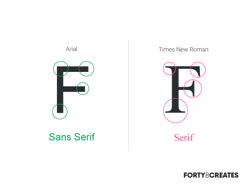
Serif
With serif, an extra stroke is added to the font. Times New Roman is a really good example of it as it is decorated in a more traditional, classic form.
Using this font is ideal for conveying ideas of professionalism, establishment and authority. Some serif typefaces include Georgia, Palatino, and Times New Roman. They are typically best suited to print media.
Sans-serif
If Serif means stroke, therefore sans-serif means without stroke. This is pertaining to the group of fonts that don’t have that extra stroke decoration. Sans-serif conveys notions of strong, contemporary, clean, and simplified.
Some common sans-serif typefaces are Arial, Impact, Lucida Grande, Tahoma, Verdana, and Helvetica. They are typically best suited to digital media.
The above-mentioned fonts are also “Web-safe fonts” meaning they’re more likely to have no compatibility issues on the internet. So feel free to use them across your visual identity, including your website.
These fonts are like your favourite jeans; they’re reliable, they fit with almost anything, and they make you look good. Wink, wink.
Style
Is it minimalist? bohemian? How is that expressed in your visual assets? Is it through shapes and colours? Does your brand prefer rounded edges or straight edges?
The visual identity comes together in a branding identity guide or also commonly referred to as a style guide.
Your Visual Identity/Style Guide
An explanation of how to use each aspect that constitutes a visual identity should be broken down and explained in your style guide.
In a visual identity guide document, often you’ll see references such as “please do not use this logo aligned in the centre” and other similar expressions. These guides are to ensure consistency not deplete your creative efforts!

How you organise your style is entirely up to you and your company. Try to keep it on brand, easy to read and most importantly easily accessible to all your employees.
However, if you do need a little help you can always download a template and go from there.
You’ll need to download InDesign to be able to open this file.
How to Define Your Visual Identity?
We have briefly touched this point on the How to Build a Brand blog but to define your visual identity you must think and analyse different parameters including target audience, competitors, goals and visions, inspiration, industry associations and gut instinct.
Delve into each parameter to learn about the process of developing the look and identity of your brand.
Think Audience
What works for some audiences, doesn’t work for others. It’s important that you take some time to test out different variants so you know what works and what doesn’t. Make sure you’re noting down what resonates with your audience.
Don’t know how to test? Well, thankfully for us, we live in the 21st century, and we have access to data and analytics everywhere we go. So we can start by measuring and keeping track of what works.
While it might seem difficult in the beginning, you just need to get into the habit of checking the data regularly.
For example, Instagram offers metrics such as engagement on the posts. If a certain post has a high engagement you should consider why that is. Is it the image? the filter? maybe the hashtags? or the caption? Wherever your suspicion is, make sure you do a couple of posts with similar individual captions, or images, or filter to test it out.
Also, only test one variant at a time, else you won’t know which change had the biggest impact on your data!
If you have noted something visual works really well within your audience, ensure that’s added to your company’s visual identity.
Similarly, that’s how your visual identity gets built over time. Be flexible, it’s not set in stone unless you are Coca-Cola or Nike, but even they had to start somewhere! The image says it all, Coca-Cola’s first logo couldn’t be further away from the 2019 current logo.
How to Communicate Your Values to The Customer?
It’s important you have an idea of your company values and your unique selling points when putting together a visual identity.
Always, always have in the back of your mind the core motto behind your company. Your visual assets should be complimenting those values, not the other way around.
When your visual assets don’t communicate actual values that the company is behind, the results coming from it are disbelief and lack of authenticity from the customers part, which demotivates sales and will leave your visual identity representing negative emotions.
Further, it could be a good idea to revise your brand personality traits before deciding what to communicate. This could be helpful to ensure your brand is homogeneous and there are no flaws in your visual identity.
Competitors
What are your competitors doing? Get a document out, list some of your competitors. What are they doing with their visual identity? Take some notes and get inspired. Note down both things you like and thinks you don’t particularly like.
You want to have something original and different from your competitors but also you want your customers to think of your business when they think of the service/product you offer via visual association. Hence, the importance of spending some time going through the different competitors of your business.
Research The Industry And Colour Associations
It goes hand in hand with researching your competitors. Look for what kind of colours and styles they go for. This is crucial to understand the colour associations related to your industry. For instance, an environmentally-focused company should probably have some sort of green in their visual identity, because that is the go-to for environmentally friendly.
Banking services tend to go for a more sober style with the use of blue tones. Ensure you do your research because this is going to be critical for when the customer interprets your brand. This could also be handy if you wanted to break the mould – knowing what the mould is in the first place will help you to break it.
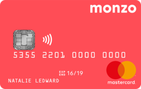
Look at the extremely recognisable Monzo card – still a bank, but unlike other bank cards, you know its a Monzo without having to see the logo. A great example of making an element of your brand “ownable”.
Whilst we’re on the topic, do consider cultural aspects when researching your industry branding:
Cultural Implications
What you might associate with your business identity other people might not. A good example of this is the colour green. The majority of people associate green with environmental causes however to Americans, green can also resemble money because their cash is green.
Consider all of these cultural implications, maybe a quick google search will help with this. In addition, this is very important if you have visions of becoming a global product or service.
Types: “what’s the meaning of every colour ever?” into Google.
Goals & Visions
What are the goals of your business? Where do you see your business in 5 years? Law of attraction anyone? Don’t forget to project your vision into the identity design of your brand.
Think about the presence of your company as it is today, but also keep an eye out for the future. Consider your brand as if it already conquered your business goals, what does it look like?
Trust your instinct and your dreams.
Look For Inspiration
As mentioned on How to Build a Brand, mood boards can be especially helpful when you are laying down all of your preferences into a place.
Relax & Chill
When you have a company, it’s hard to distance yourself from everything. But very often we will instinctively know what
Often, we see entrepreneurs quit on really good and substantial designs because they’re overthinking it.
Integrating your Visual Identity –
Ensuring your visual identity is a part of your brand’s office culture.
Ensuring your (now) defined assets reach every employee and that they know where each asset is, is perhaps one of the most difficult parts of getting a visual identity. It can honestly take years if not done properly.
Despite being a very individual task to each company, here are some tools and techniques we use here at Forty8Creates to make the process much smoother and more intuitive.
Adobe Libraries
Utilising Adobe libraries is a must here at Forty8Creates. This tool is practical to quickly store colour codes and vectors for Forty8Creates that we often need access to. If your company happens to have adobe programming, this is a great tool to keep yourself organised and/or quickly copy paste the code of a particular colour.
You can store typography, colour, gradients, vectors and many other marketing collaterals. Adobe library (on the right bar side) is a great way to organise your visual identity and keep it practical.

Google Doc. Templates
If your company uses a lot of forms and documents, and these happen to mandatorily be written under the company’s styling, then Google Templates is about to revolutionise your workflow – if it hasn’t already!
Just create a plain document (pre-formatted with typographic, logo, numeration, header and footer) and upload.
Every time an employee needs to use a document he or she just go to file > new > from the template and the template will be there for use.
Don’t worry about ruining the template because as soon as the doc is uploaded it creates a copy for use every time. Once it’s clicked on, it ordinarily just copies and pastes a new document based on the template you’ve set up on the drive. It doesn’t overwrite the original content.
You can have different Google templates for different things including excel spreadsheets, graphs, reports.
In a corporate office, I would recommend having different templates with word-marks across them for drafts and internal documents only.
Creation of Internal Templates
Particularly, for social media channels, this could be helpful for the rest of your team. You can instruct your graphic designer or design agency to create some templates so the rest of your team can add content easily on a daily.
This can avoid some headaches and make your team produce good quality content much faster which is great.

On-boarding/Welcome Guide For New Employees
To ensure new employees understand your visual style from the get-go, why not put it all on a guide for the new staff? Not only this is useful for your staff but also, it’s useful to avoid any accidental style slip-ups.
And here we are.
You officially know everything and anything about the process of creating your brand’s visual style.
Do let us know if you have any other questions we can help you with.
Just remember, sometimes the less you think about it, the better it is. Except for maybe politics.
Now go get them, tiger.
Tags: downloadable, identity design, style guide pdf, visual identity:
Categorised in: Branding, Graphic Design, Small Business Branding