
Graphic Design Rules You Should Never Break
In life, you can generally accept the adage “Rules are made to be broken”. There is however a very good reason that graphic design rules need not be broken.
Graphic design rules are governed by the end user, in that you should always design for your audience and not your own personal preference.
Here are some graphic design rules that should never be broken…ever!
1. Consistency Is Key
As with many things in life, consistency is key in design. When creating graphics and design for your brand, you want to have consistency in how they look and feel.
Consistency gives us the ability to recognise brands and brand extensions such as marketing materials.
Imagine if Nike suddenly changed its body copy to Comic Sans. 1. Designers all over the world would lose it. 2. We would probably all assume the text wasn’t actually from Nike and view it as a fake.
We make unconscious connections with consistency and are comforted by it—especially when it comes to the brands we have come to trust.
2. Legibility Is a Priority
The entire graphic design industry was built around the ability to problem solve and communicate. Naturally, most of us as designers are excellent problem solvers, but we often forget who we are communicating with.
Legibility is extremely important when trying to communicate with a certain audience.
If your audience finds it hard to read, has to squint or generally work harder than usual to figure out what’s being said, then your work and the messaging will be ignored.
Your typography choice and colour choice help dictate your legibility. You want it to be easy to see and read your designs.
A clear contrast in text makes this possible. Some typography do’s and don’ts are to focus on contrasting fonts that complement each other and to steer away from very ornate fonts for body copy. Your colours should also contrast as well; having pale pink on a white background makes your audience have to work for it.
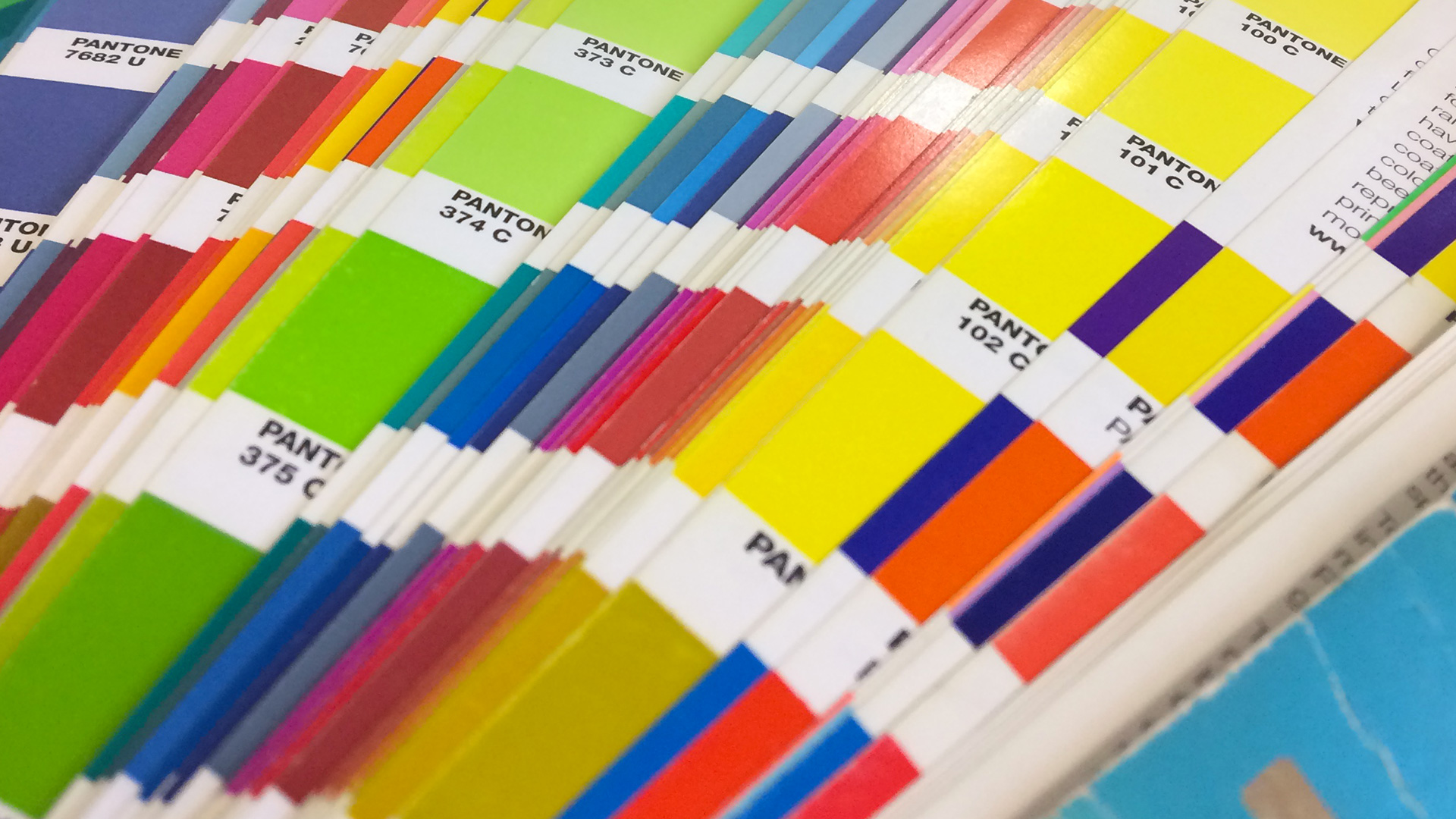
3. Avoid Colour Discord
Ever look at something and your eyes go funny? This is called colour discord, and when it happens you tend to feel as if the object you are looking at is vibrating ever so slightly.
This subtle movement means the colours don’t contrast well; meaning you may need to rethink how your colours are layered on top of one another. Do you have a purple shape over a red background? Or maybe a blue on yellow?
As a general rule make sure to use dark colour foregrounds on a light background and vice versa.
When we say light and dark backgrounds and foregrounds, we don’t mean to move you away from colours! You can still have colourful designs, just pay attention to how you’re pairing them.


4. Scaling Not Stretching
In a non-designer world making something bigger is as simple as click and drag. In the design world, you want to scale not stretch an image. Scaling means you’re keeping the inherent shape and proportions of the image.
Always scale your objects, don’t stretch them.
Hold shift when resizing objects and use the corner anchor points rather than the left/right, top/bottom anchor points. For added accuracy, you can hold APPLE + SHIFT which will scale the object equally from the centre.
5. Know Your Tools
This is an important graphic design rule to follow. There are a plethora of different tools available today to create images—especially ones for social media. But remember, each of these tools have a different use.
As a rule of thumb, you would always use Adobe Illustrator to create images that require scaling. This is because compared to the raster (pixel) based images that Adobe Photoshop produces, Adobe Illustrator produces vectors which results in the ability to scale without losing clarity.
6. Consider Hierarchy
The hierarchy rule isn’t for aesthetic purposes only, hierarchy plays an important role in how people read and process the information being presented.
Hierarchy means you’re creating, well, a hierarchy to your text. It places importance on some text, usually by making it larger than the other information presented.
Hierarchy is especially important when there is large amounts of text. Example: Using subheadings break up large amounts of text and make it easier for the reader to skim through to a paragraph that’s relevant to the information they are looking for.
7. Check It Twice: Focus on Spelling
Experiencing the horror of spelling errors going to print will be enough to ensure you always check, and check twice, the spelling in your assets.
We recommend having a second set of eyes review anything before you publish it or send it off to print. Like anything, when you’ve been working closely on a project, you can start to overlook some of the details. A fresh set of eyes is invaluable.
8. Whitespace Is Your Friend
It can be human nature to want to fill the space and create something bigger. But this isn’t always better. Whitespace is definitely your friend.
Cramming text and images into every inch of your design will make your design chaotic and hard to digest. As you can see from the example below, the use of white space is generally relaxing and gives a sense of space.

9. Use Your Grids
A rule that changed my life as a graphic designer. Using your grids should be the rule to abide by at all times.
Grids are often used in the Adobe InDesign programme and give that all-important uniformity and consistency to your designs. Using a grid will tighten your design and give you some rules—even self-imposed—to stick to throughout the document.
There are a couple of different types of grids in an Adobe Indesign document, all of which serve different purposes. Your baseline grid is super important when typesetting large chunks of body text, whilst your document grids help you to align your columns.
10. Make the Align Tool Your Best Friend
The above grid rule feeds very nicely into our last graphic design rule—make the align tool your best friend. Even if you think you have laser accuracy when looking at the screen, don’t always trust your eyes.
Using the align tool will make doubly certain the objects on the page are aligned perfectly. Even a few pixels out can make a huge difference to the overall feel of your work.
Naturally, this isn’t an exhaustive list, but these remain the foundational rules of graphic design. Using these fundamental design rules will help you to create beautiful, yet functional pieces of work for your brand.
Happy designing—as long as it’s within your grids!
Categorised in: Graphic Design