
Gender Neutral Design
Design, just like the rest of the arts, is a direct manifestation of the current cultural atmosphere surrounding creatives. At Forty8Creates, it’s our job as a creative agency to stay up to par with trends and growing creative manifestations. It’s also our duty to learn how to fluidly integrate new trends into our designs, be inspired and define the frameworks to integrate these trends effortlessly into the business world for a prosperous company asset building.
The fast-growing trend and rising demand for designs that are genderless have prompt us to make this blog. In this blog, we’re shedding light on some of the different technical and stylistic aspects that define the gender-neutral design style.
” We are living in a time of gender revolution.”
Metropolis
Keep in mind that the trend for gender neutrality in design is still very much in its beginning stages. Designers and artists alike, part of the movement, are still very much perfecting, evolving and developing smart design solutions that promote gender inclusivity and the diminish of use of gender stereotypic roles that are so engraved in both design norms and society.
We’ve tried our best to summarise the main characteristics of this growing trend, however, this trend might change in the near future and shape out to become a different end-product. Continue reading to learn more about the stylistic elements that are defining the gender neutrality design trend and how you can integrate some of these elements across your brand’s identity.
Avoidance of Gender Colour Stereotype & Association
Blue & Pink Dichotomy
Did you know that the predominant colour for baby girls used to be baby blue? The colour pink wasn’t generally associated with the female gender until the 1920’s when the trend inverted.
Up until then, pink was seen as a boy’s colour based on Christian tradition and classical paintings. Blue was traditionally associated with the Virgin Mary and therefore a “girl” colour.
Post-1920s, blue became the colour associated with the male labour force due to the work/naval uniforms and the dichotomy remained up until the 21st century. Some sources believe today’s design is still very rooted in Modernism and therefore very much inspired by a male perspective.
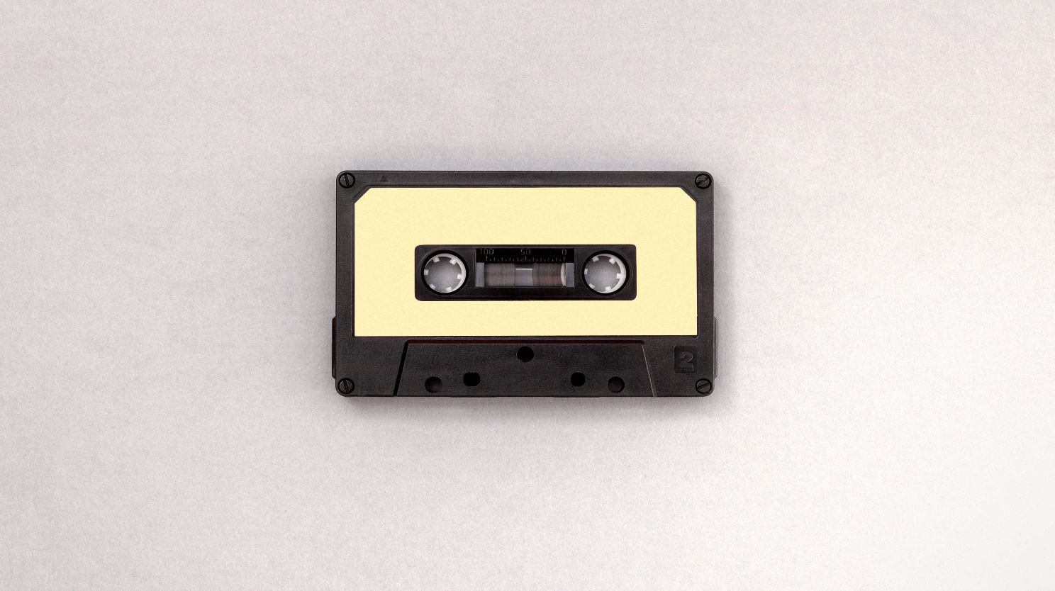
Gender Neutral Colours
A big part of the gender-neutral style has to do with colours. A big part of the gender neutrality trend is the disruption of the already pre-established stereotypical gender styles: the use of pink for girls and blue boys.
Because of the element of disruption, the use of pink and blue is avoided even in contexts not associated with gender. If for some reason shades of pink and blue are being resourced, they happen to be in muted tonalities or different shade ranges that aren’t immediately associated with gender.
Gender-neutral colours are typically muted, and minimalistic:
- greys
- black
- white
- yellow
- green
- orange
- light browns
- muted tones in general

Typography
Fonts tend to be easily associated with gender due to their stylistic effect. Traditionally fonts that are thin, decorated, cursive tend to be associated with the female gender. Whilst fonts that use geometric, sharp, straight lines with definite edges are associated with the male gender.
There are some fonts that are labelled as “classical” that don’t necessarily have any gender association to it such as Roboto, Helvetica & Garamond. Although there hasn’t been a significant development in regards to gender-neutral fonts. Helvetica is possibly the most popular gender-neutral typeface.
With that being said, variations of Helvetica can still connotate gender, for instance, Helvetica ultra-light appears to be quite feminine and Helvetica extra bold appears to be quite masculine.

In the near future, we’ll see the growing popularisation of other fonts that are more gender-inclusive.
Imagery
The imagery that supports gender inclusivity is, as the name suggests, one that doesn’t picture just one type of gender and with it and its stereotypical gender norms. When photography pertains to a group of people, it’s important that this group of people are diverse and not just one gender.
Avoidance of Product Photography Heavily Sexualised
Advertising imagery targetted to a specific gender tends to be heavily saturated in stereotypical imagery that depicts women products as feminine and man products as masculine.
For example, advertising from brands such as Dove depicts imagery that’s very light, soft and delicate as it’s targeted to women. Whilst Gillet targets a male audience by resourcing imagery that is dark, intense and bold.

In order to resource gender-neutral imagery, it’s important to be aware of these returning stereotypical cliches.
Colour across gender-neutral imagery is distributed in a simplistic, sporadic manner. It’s also been very much associated with the Scandinavian style.
A common denominator of most gender-neutral imagery is the emphasis on product functionality instead of gender in terms of product advertising.
For example, the cosmetic brand Aesop is doing a great job at appealing to both genders by restraining themselves from stereotypical gender profiling. Here are some of their campaigns that feature gender-neutral imagery, packaging and colour palette.

Burberry directed by Riccardo Tisci has been one of the responsible for popularising gender neutrality in mainstream fashion. The campaign imagery alludes for the use of androgynous-looking models that could be either male or females. In addition, even the designs and picked colour palettes that include muted toned colours such as mauve, green and brown- very resonant of a gender-neutral style.

Androgynous Aesthetic
The Androgyny is the combination of masculine and feminine characteristics into an ambiguous form of human-like character. Whilst the androgynous aesthetic isn’t new, it definitely has had a reassurance into the mainstream thanks to the brands such as Gucci and entertainment figures that have brought the aesthetic back.
In the 80s, Bowie was the highest manifestation of the androgynous aesthetic. This aesthetic is highly associated with gender-neutrality so you can include this into your brand’s imagery if you want to communicate a non-binary gender identification or avoid gender stereotyping in general.

Icons
Just like in typography, smooth, curved line icons are usually targeted towards a feminine audience and straight, sharp edges used to appeal to a masculine audience; the same goes for the use and design of icons.
As previously mentioned, colour is really impactful in regards to the perception of gender and it’s no exception in regards to icons.
Gender-neutral style icons tend to mainly have an outline in one colour or gradient instead of being fully coloured. The chosen colour tends to be a neutral or an accent colour that isn’t associated with a particular gender (such as orange). If reading this and thinking…what? this makes no sense…well…just have a look at the image below.

Gender-neutral Glyphs
Glyphs are a challenge due to how engraved they are into society. From bathrooms, to signal traffic lights they’re everywhere and they depict a gender. Glyphs with a skirt denotate a female gender, and glyphs without a skirt denotate the male gender.
If you don’t remember what a glyph is, they are by definition an “a hieroglyphic character or symbol.” But basically they’re the symbols that help communicate a message such as a zebra crossing icons, the danger symbol and others that help us co-exist in society.
The brand Turbotax describes what it was like to create gender-neutral glyphs from scratch in this article. Recently, designers have been developing gender-neutral glyphs and we should expect to see some more of them arising in the near future.

Packaging
In order to understand how companies can design packaging products that are gender-neutral, it’s important to understand gender stereotypes in traditional packaging design.
Men products tend to feature a matt black, dark blue or chrome.
Packaging for men also tends to feature sports imagery or sports connotations via copywriting.
Packaging “for” Women
Products and toiletries aimed at women are traditionally in pink colour. Often women’s package features sleek packaging, flower pattern, rounded iconography and occasionally….sparkles.
In recent years there has been a massive shift against the use of pink and traditionally “feminine” graphics in products which pushed the development of the gender-neutral movement further. In supermarket shelves, there’s more variety of colour when it comes to feminine products thanks to that. For instance, period products such as Aunt Flow and TOMT don’t feature their products in a commonly pink, soft, bubble gum but instead are using yellow, blue and gender-neutral patterns to appeal to the millennial market.

The Pink Tax
The controversial Pink Tax made a lot of consumers aware of how gender stereotyping is present. The Pink Tax charges more money for the same product under a packaging target at females. Some examples of this include Gilette charging more for razors in a pink packaging or BIC charging more for pens “for her”. Some brands, such as Cards Against Humanity, have taken the opportunity to ridicule the situation, by creating a collection in exclusive for women: Cards Against Humanity For Her in response to stereotypical gender design.
The profits from Cards Against Humanity For Her were donated to Emily’s List, an organisation that fights to end discriminatory pricing practices against women.
The Pink Tax, although unfortunate, has allowed for the gender-neutral design stye to develop further making the industry of makeup, toiletries and products the industry that has witnessed a stronger gender-neutral presence with brands.

Gender – Neutral Product Packaging
Needless to say, that gender-neutral packaging that is exclusively targeted for one gender (eg.tampon boxes), shouldn’t be covered in graphics of flowers and ribbons or sports connotations.
Gender-neutral packaging tends to feature minimalist packaging but perhaps the most outstanding feature is the emphasis on product practicality. Product functionality is a big trend within gender-neutral product design.

Some brands that are choosing to focus on functionality instead of gender targetting include the perfume brand Byredo, the cosmetic line The Ordinary, the skincare brand Curology.
Gender Design in the Future
Will colour stereotype and gender–targeting vanish in a couple of years? or is gender neutrality an ephemeral trend?
The current business landscape is undoubting shaping towards a more gender unbias targeting.
The growing risk of alienating consumers by resourcing specific gender stereotypes across packaging design is pushing companies to invest in the development of gender-neutral assets.
What are your thoughts in gender – neutrality design? Where do you see this trend delve into? Do you reckon it’s a temporary trend or a movement that will mark the current generation?
Let us know your thoughts and if you want to add anything to how we’ve defined a gender-neutral design.
Tags: design, movement, Non-binary gender identification
Categorised in: Branding, Graphic Design