Packaging Glossary of Jargon: Design and Printing Terms
Part of being a product entrepreneur is to become familiar with the different design terms used to describe a product and its packaging. With that being said, at Forty8Creates we’ve noticed that comfortably addressing packaging parts without referring to it as “the thing that looks like… that other thing” is a common struggle point for different company founders.
If you’re designing packaging or at least selling a product that requires some sort of packaging, here is the basic jargon you’ll be hearing.
In this blog, we’ll introduce the jargon you need to be familiarised with in order to accompany the process of designing and producing packaging for your brand.
Packaging Design Terms
Overpackaging
Overpackaging is a very relevant design term, especially in today’s environmentally focused landscape. As the name suggests, the term is used to refer to the situation in which products have unnecessary packaging or are dramatically over packaged for no logistical reason whatsoever.
For instance, do you remember that viral image that was circulating of the bananas siloed in a vacuum plastic container? That’s overpackaging because bananas already have a natural cover, there’s no need to add to additional covers. However, there could be an argument for plastic acting as a barrier to retain the freshness of the product.
FYI, products that come in a tight plastic film and are sealed to ensure oxygen doesn’t penetrate are called “vacuum packed”.
Some other examples of overpackaging, which you may recognise, are Amazon’s giant boxes that often come with one small item inside. You don’t want to be that company that overpackages, millennials are hyper-aware of a brands environmental impact.

Prototype
A prototype is a design term used to describe an early model or mock-up of the proposed design. Prototypes are a preliminary version of the final developed concept. They’re not made to look pretty but rather to evaluate the functionality of it and to understand how they look. Sometimes also called a “blank dummy”. It is highly recommended that you prototype your packaging before you order a shipment.
You can ask for a prototype of the packaging simply by asking the manufacturer for a sample. Physically seeing and interacting with your packaging will always be more useful than just looking over the technical drawings.

Printing a dummy is basically printing the first copy and fully analyse it, see if it’s ready for mass-scale production and to get both parties aware of what the final product is going to look like. Typically once the dummy has been approved, mass production of the product can confidently start.
Primary Packaging
Primary packaging is referred to as the wrapping or containers handled by the consumer. Basically, primary packaging is the last thing your user touches before fully touching the product. Like the wrapping before a burger or a lid to a pickle jar.

Secondary Packaging
If the primary packaging was the last thing a user touched before interacting with the product. Secondary packaging is used to describe the packaging/protection that is used to group primary packaging and packaged goods.
Cases, boxes and point of sale units (POS) that facilitate shipping, distribution and shop display can be considered secondary packaging.
Shelf-Ready Packaging (SRP)
We use this design term when we want to refer to a container with ready to sell products. SRP packaging tends to go straight from the factory to the retailer who uses that same shipping box as the point of sale unit. Products that tend to use SRP include items such as juices and toothpaste. You can see some more common products from the examples below:
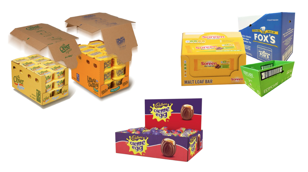
You can also find this design concept referred to as retail-ready packaging (RRP).
Shelf Appeal
Shelf appeal describes how a product’s design looks at the point of sale in comparison with its competitors on the same shelf, aka how your product looks when displayed. It’s important that the design of your products stands out on the shelf and alludes the consumer in to purchase. Particularly important if your product has shelf-ready packaging.
Stock Keeping Unit (SKU)
A stock keeping unit (SKU) is a term applicable to retail industries and is a coding system that expresses each individual product line and size variant. Each SKU is unique to each product and each retail chain, although they’re very common to be located next to or underneath the bar code.
This number of stock keeping unit is useful for store managers to understand if there’s a need to restock, whether they’re products missing or how many products have been purchased. SKU have different categories, and or often composed by numbers and letters.
Substrate
Substrate the name given to the material that the design is printed onto. This could be any material such as carton, board, polypropylene, metalised film, etc.

Structural Packaging
Structural packaging is a design term that describes the three-dimensional (3d) forms aspect of a product’s packaging.

Universal Product Code (UPC) Bar Code
This is an important one. A UPC bar code consists of the first 12 numbers that are randomly (but unique!) assigned to each product.
The UPC bar code identifies the number and symbol of a product. It also gathers information on size, colour, configuration, name and other additional attributes.
If you’re thinking of designing or getting your product’s packaging designed is one of the earlier steps that absolutely critical that you preemptively signed up for your universal product code.
In order to get a unique UPC for your product, you must apply for a GSI company prefix, which you can do here. As the name suggests, the universal product code works universally and not just in the UK or in a single country.
It’s important that you sign up for the UPC early on, so your packaging’s design can be put together around it rather than inserted retrospectively. A bar code that looks out of place looks disintegrated and it takes away from your product’s packaging.

Packaging Printing Terms
Offset Printing
We refer to an offset printing when the inked image is transferred to a printing surface. It differs from digital printing in the sense that offset printing is inked from a plate to a rubber blanket and only then to a printing surface.
This method dates one of the oldest methods of reproducing artwork dating mid 19th century. It sort of works like a steam-punk scene from a factory. There are ink cylinders and water cylinders coordinated on top of a paper cylinder that moves to print.

Modern days offset printing is one of the most economical methods suited for high volumes. Additionally, nowadays offset printing is coordinated with computer-to-plate-systems which further increases productivity and quality.
Digital Printing
Digital-based-printing is pretty much the opposite of offset printing. It’s printed with the assistance of high-volume laser or inkjet printers.
Digital printing has a higher cost when compared with offset printing however digital printing requires less technical preparation. Because of this, one of the digital printing benefits is its short turn around time and the less labour intensive the print requires.

4-Color-Process
We’ve previously addressed the CMYK versus RGB in 10 Design Jargon Concepts Debunked blog post but here’s a break down of the also known as 4-colour-process.
The 4-colour-process is a printing method that as the name suggests uses 4 ink colours: cyan, magenta yellow and black (CMYK). This process is more used for printing colour images in press, publications and editorials.
The CMYK process works when full-colour images are created by pressing different layers of colour to create new colours. These are also applied by pressing tiny dots on the paper or substrate.
Bleed or Bleeding Edge
The bleed or bleeding edge is a term that defines the blank space/edge between the printing image and the page. The bleed area allows for some movement and design inconsistencies. Just in case the ink “bleeds” outside its line.
As mentioned in the 10 Design Jargon Concepts Debunked blog “Bleed refers to a part of the page that will be trimmed during printing. Some documents might have elements that go beyond the edge of the page as they bleed off of the page. This is to ensure there is no white margin in the printed form, a bleed is added to the document.”
Chloe Smith
A document with a bleed is printed on a larger sheet of paper and then trimmed to ensure no white is shown at the edges. To ensure space between the edge of the page and your content, you would use a margin.

Pantone Matching System (or PMS)
As briefly mentioned above, the Pantone matching system has a wider range of colours when compared with the CMYK system.
The Pantone Matching System organises it its colour by numbers, a three to four number digit followed by the letter C U or M that stands for “coated,” “uncoated” and “matte,” respectively. PMS is constituted of around 1,114 colours.
Also, the Pantone Matching System is capable of producing different colour effects such as metallic and fluorescent. The system has grown into becoming the go to system and highly used by graphic designers around the world.

Blind Embossing
Bling embossing is the term given to the graphic design techniques of creating raised artwork on paper without the use of ink. The logos (or characters) are designed raising from the paper. When printed, one can feel the embossing by touch.

Foil Emboss
Foil emboss refers to that metallic finish almost “foil-like” you can add to your product’s packaging. It works by applying a pigment of metallic foil (often gold or silver) pressed onto the paper’s surface with a heated tool.

Crop Marks
Crop marks also known as trim marks, are lines located on the corners of your sheet project so the printer is aware of where to trim the paper.
It’s used by commercial printers to know where to trim the paper when an image or colour on the page needs to extend all the way to the bottom of the page.

Dieline
Dieline is a graphic design term that refers to a plan layout and cut lines of a packaging. The dieline marks where to print and fold and it’s a guide for printers to understand the product’s shape.

Matte Finish
We know this one from makeup! A matte finish describes a non-shiny texture. You can opt for printing on paper that as slight shine to it or a completely matt (Anti-reflection) finish.

Score
In printing terms, a score refers to creating a folded line on a printing document.
Creating a crease in the paper so the document becomes easier to fold. Basically, a line where the document will eventually fold.

Varnish
Just like the name suggests varnish is a coat of gloss added to the print.
Spot Varnish
Spot varnish is the fore-mentioned varnish applied to specific portions, for decorative purposes. This is a very common technique used mainly for books covers. This spot varnish tends to be very glossy and metallic (basically the opposite of a matte finish).

UV Coating
UV coating is a concept hard to explain as it can easily be confused for a metallic finishing. A UV coating is very glossy, shiny, liquid-like coating added to the printed material. It almost looks like dripped oil. This coating hardness as it’s exposed to ultraviolet lighting and that’s how it gets its sleek-oil-like finish. Hopefully, the imagery is self-explanatory.

Part 1 of packaging jargon has been officially concluded. Send us any questions that might have come across your way and any feedback on how useful these blog posts are.
Hopefully, this elucidates some of packaging terms.
Now, go be the packaging queen you’ve been destined to be!