Shaping a new user experience through dashboard design
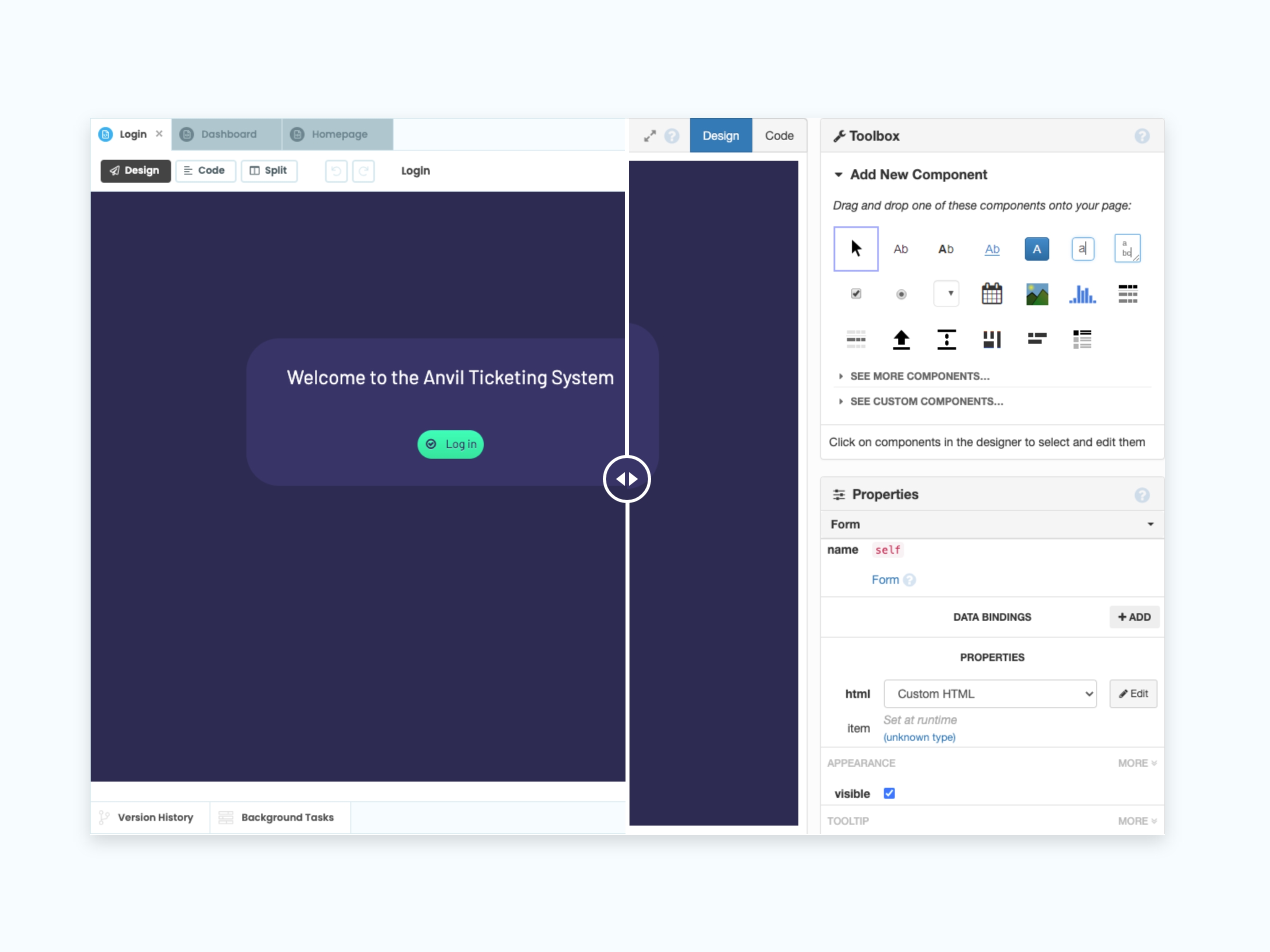
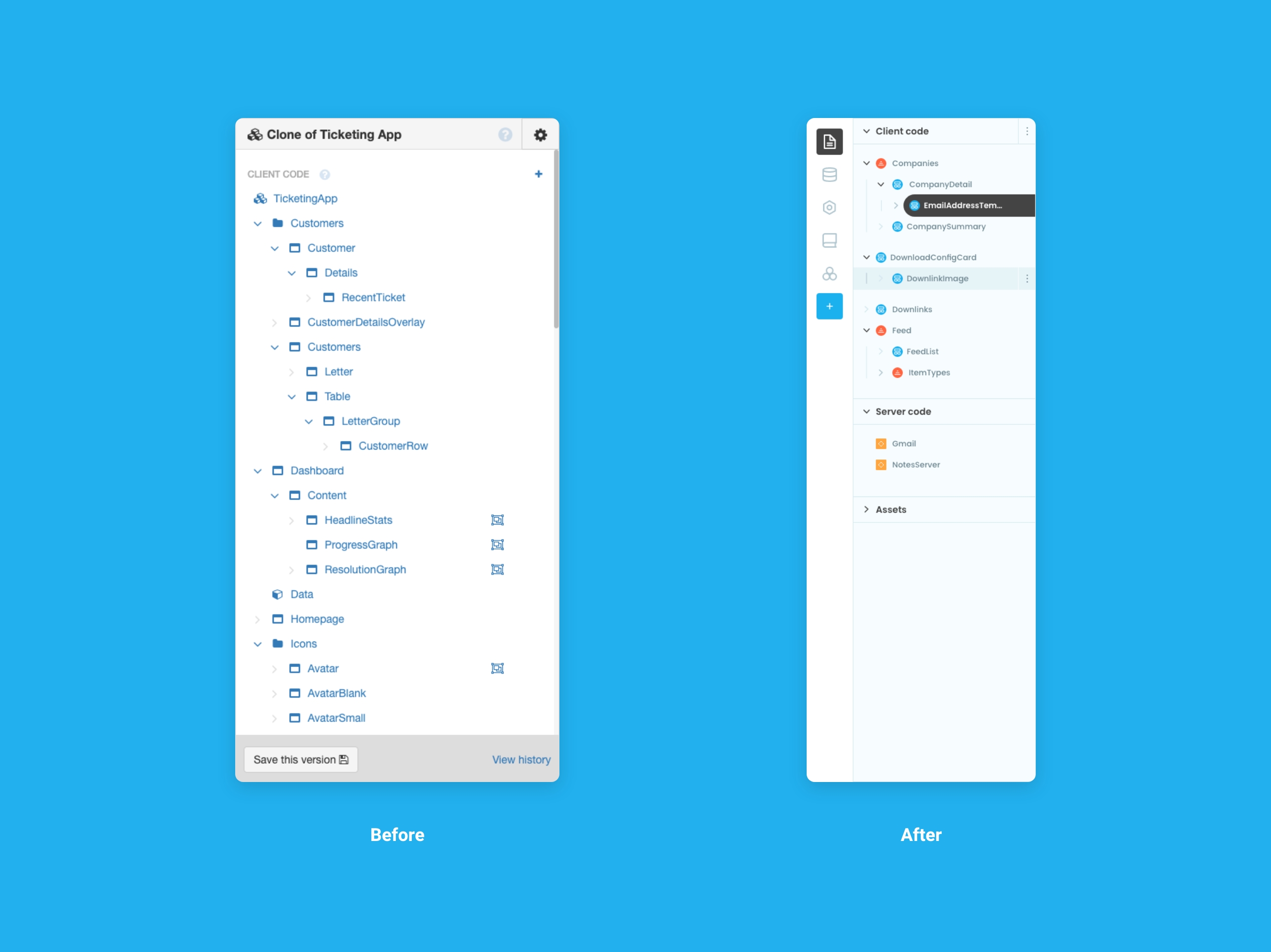
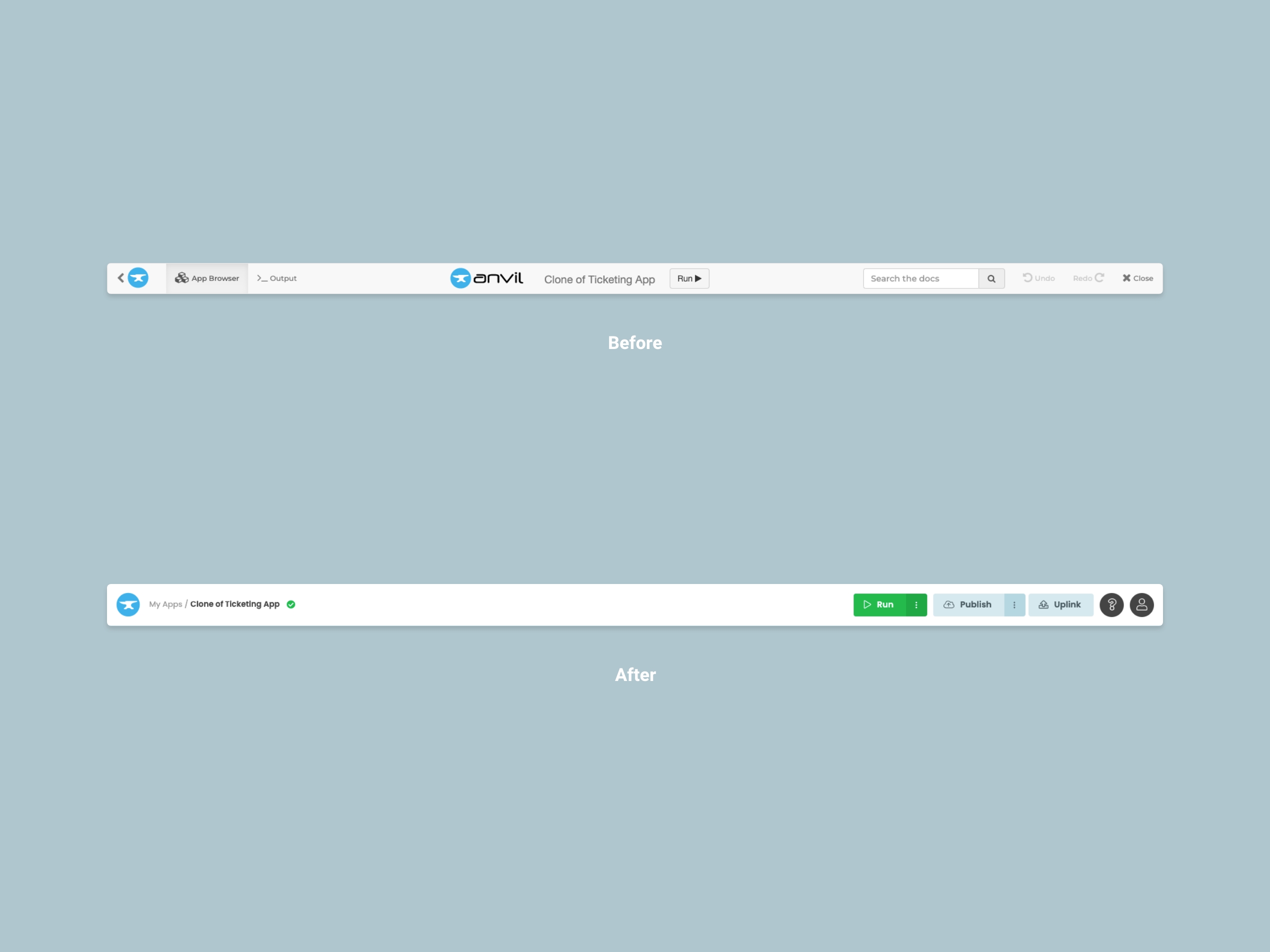
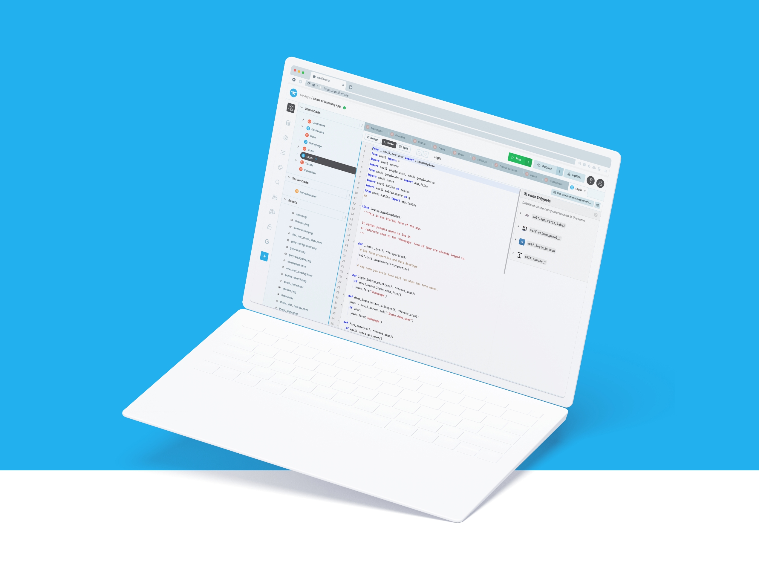
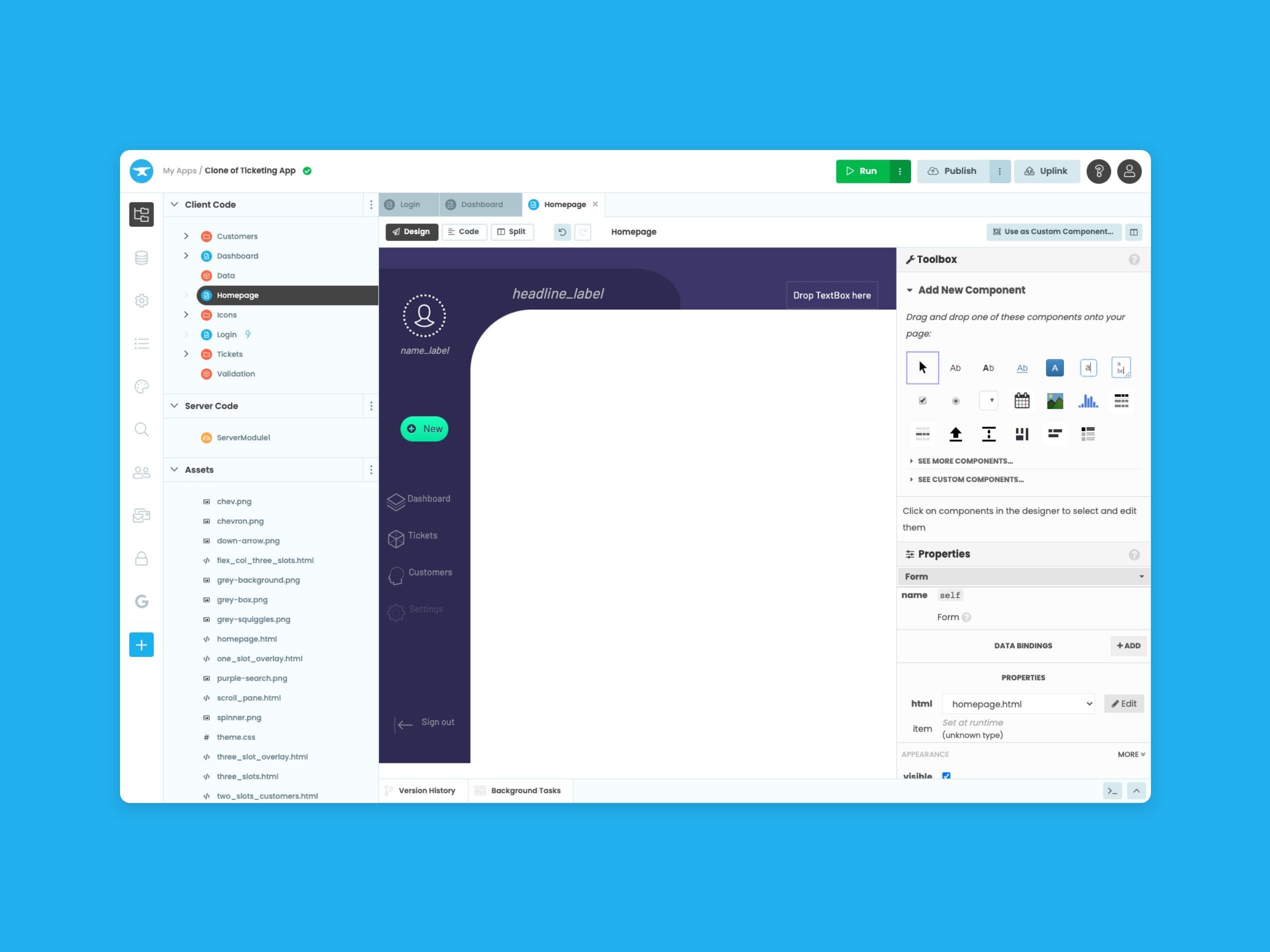
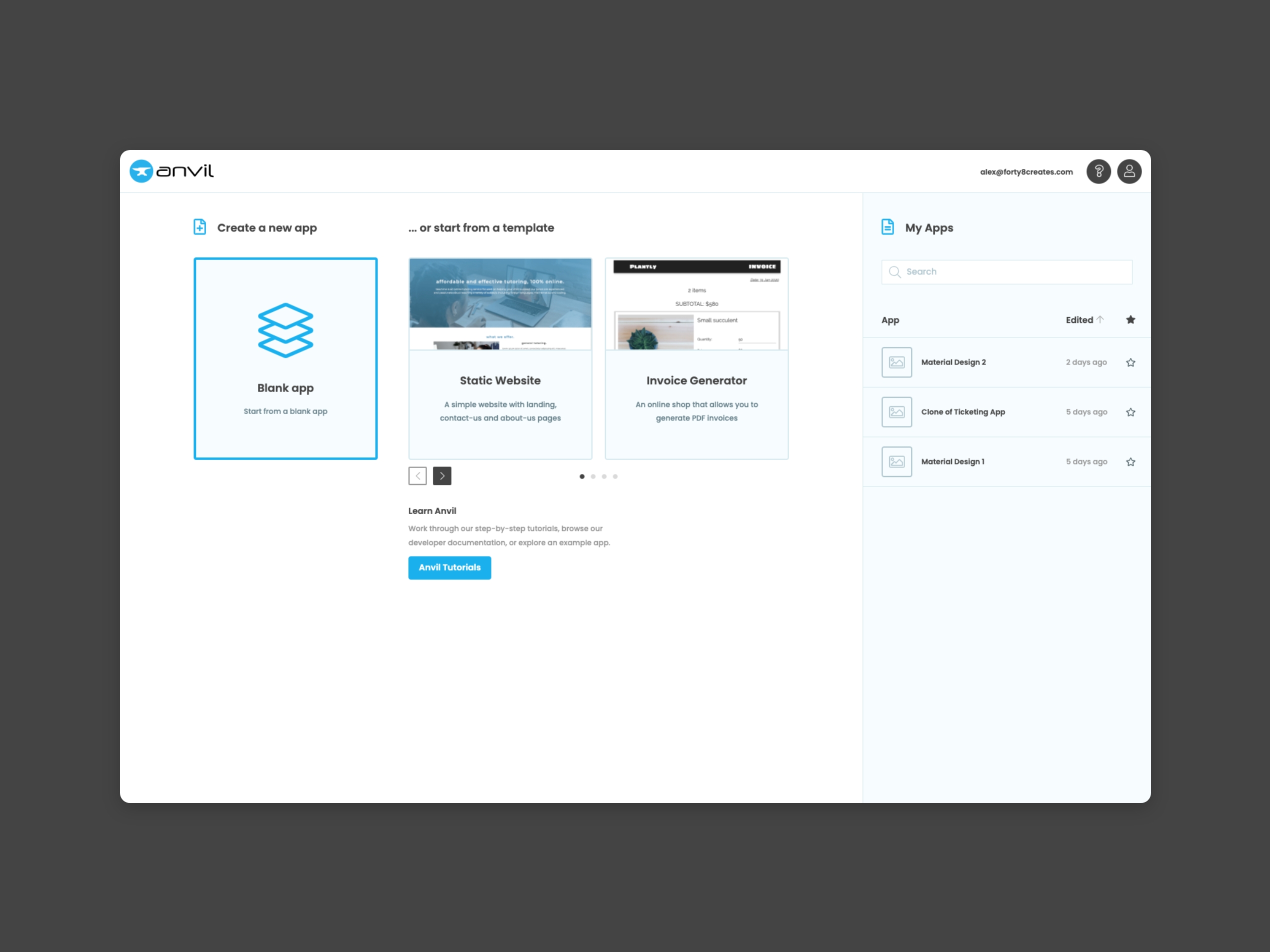
Having the right tools for the job is a universal principle we can all agree on. Being able to locate and use those tools is a whole other story. Anvil, the software for building Python-only apps, had the right tools; just not the right user experience. Suffering from information overload, the dashboard was heavy and scattered.
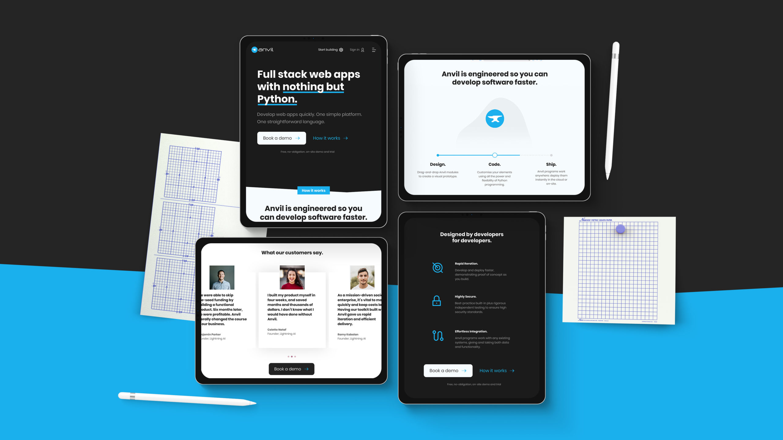
Seriously powerful, playfully simple.
Complexity requires simplicity and a drag n drop tool that has it all can be overwhelming for even its seasoned users. Redesigning the file browser and user interface was paramount to the success of the project - after all, the tool worked well, you just needed a degree to be able to use it.
Limited colour palette, unlimited configurations.
Never wanting to overwhelm the user, we developed a limited colour palette that complimented the Anvil blue without compromising the hierarchy of the information. At a quick glance, you can start to see visual connections between the elements within the tool, making navigation easier, speeding up workflow, and reducing the onboarding time of new users.