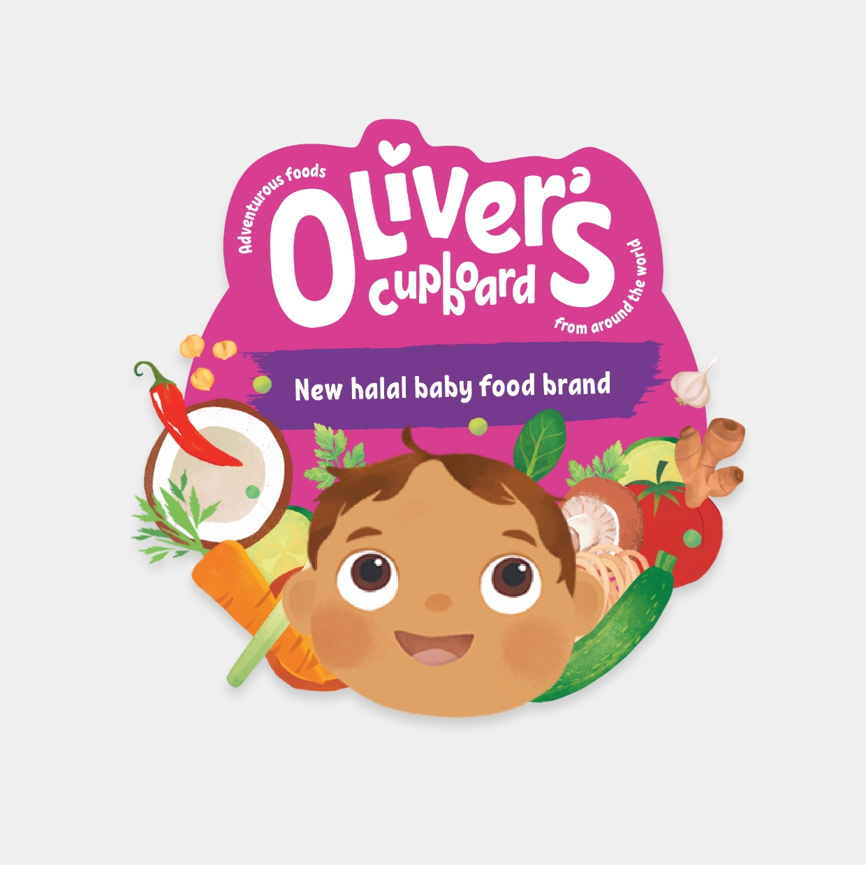
A full flavour visual identity
When a new mum was left wondering why the shelves of supermarket chains didn't range world foods for babies, it sparked an idea that set out to change the face of weening.
It's the little things that make a big difference.
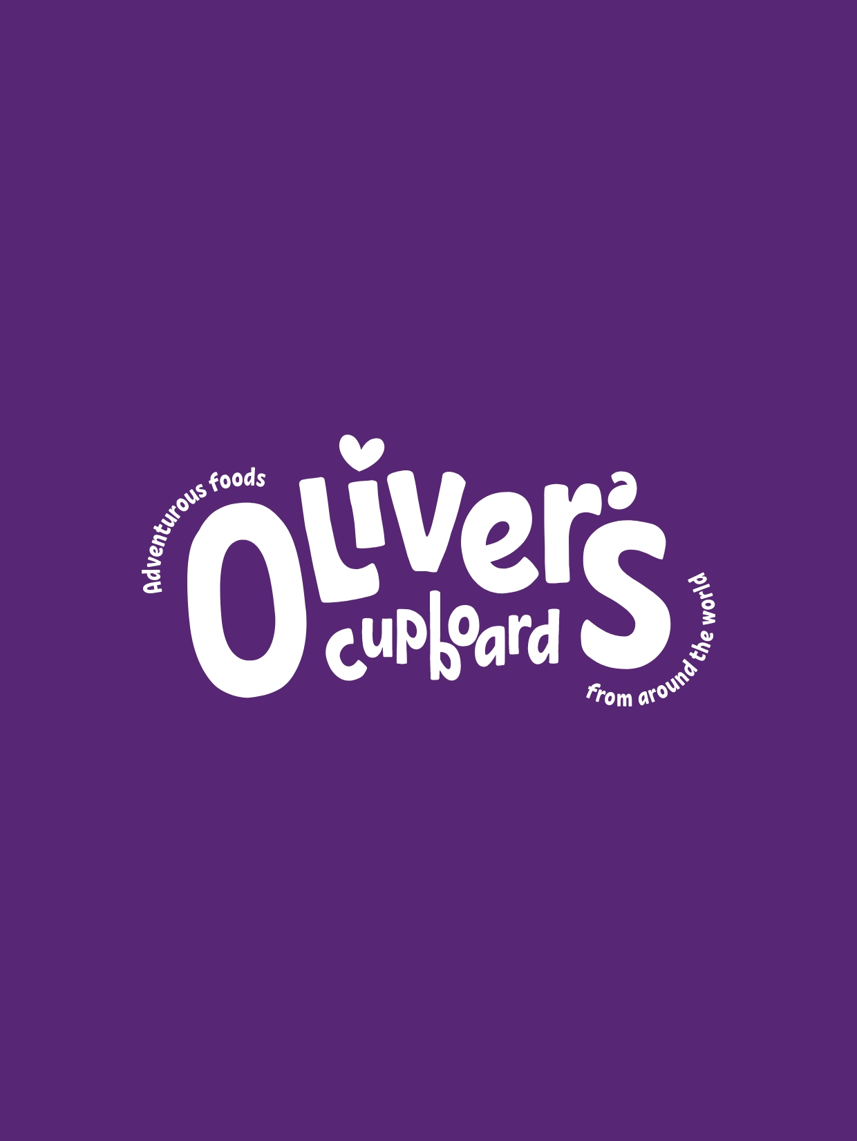
The creation of this logo started off with the idea that every child is unique. Being the "perfect mother" only exists in fairytales. Being a parent is messy, nonlinear, and has its ups and downs. The logo design reflects the subtle differences every parent experiences when trying to grow a new human.
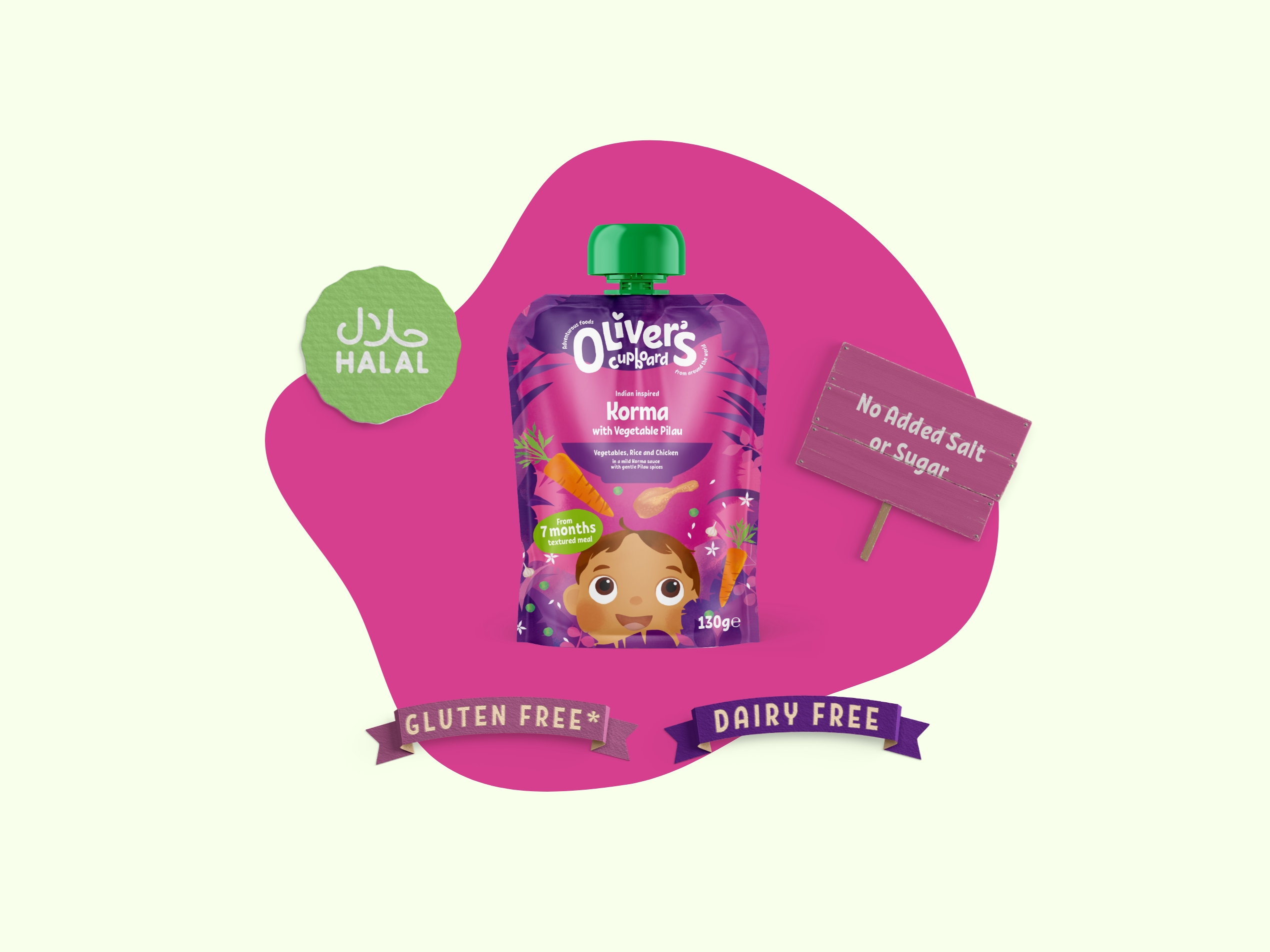
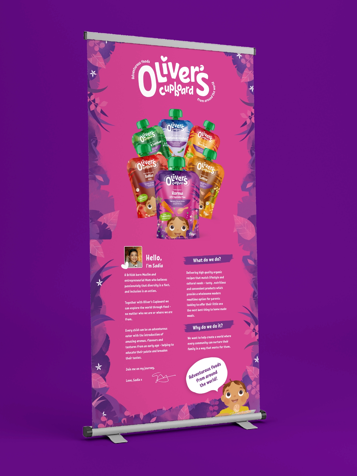
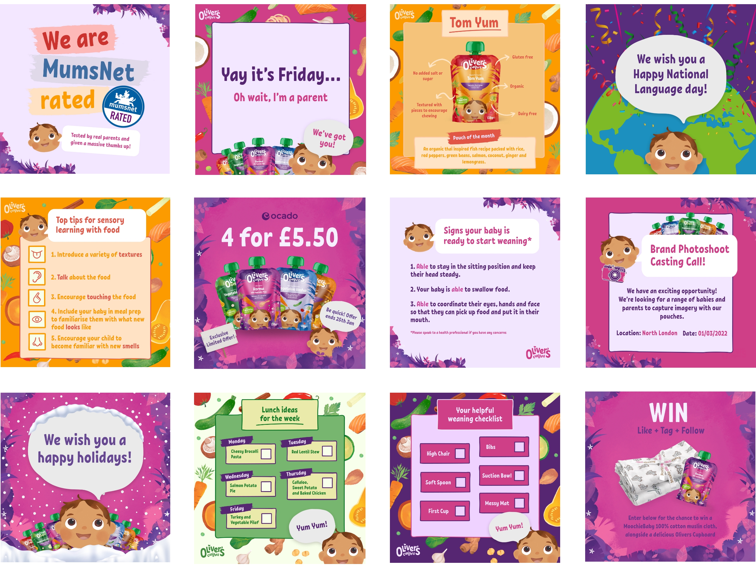
A small pack, with a big mission.
With shelf space at a premium, and with audience attention at an all-time low, grabbing the eyes of your target audience is a decision made in a split second. Ensuring the decision to purchase is a tough one, but one that is helped by a stand-out packaging design, which houses a stand-out product. Shelf appeal is number one priority (after safety) in our packaging design considerations.
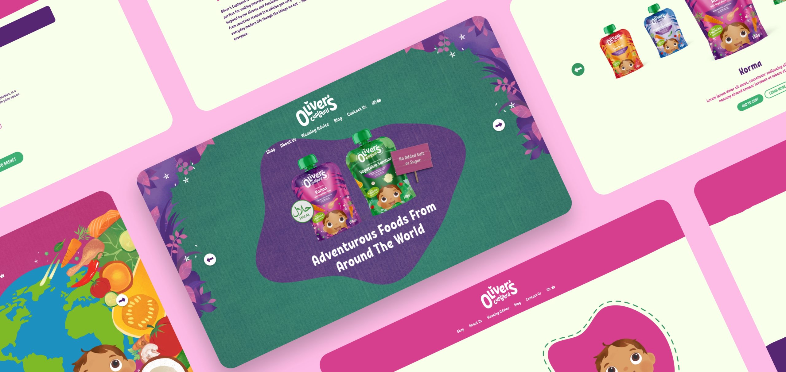
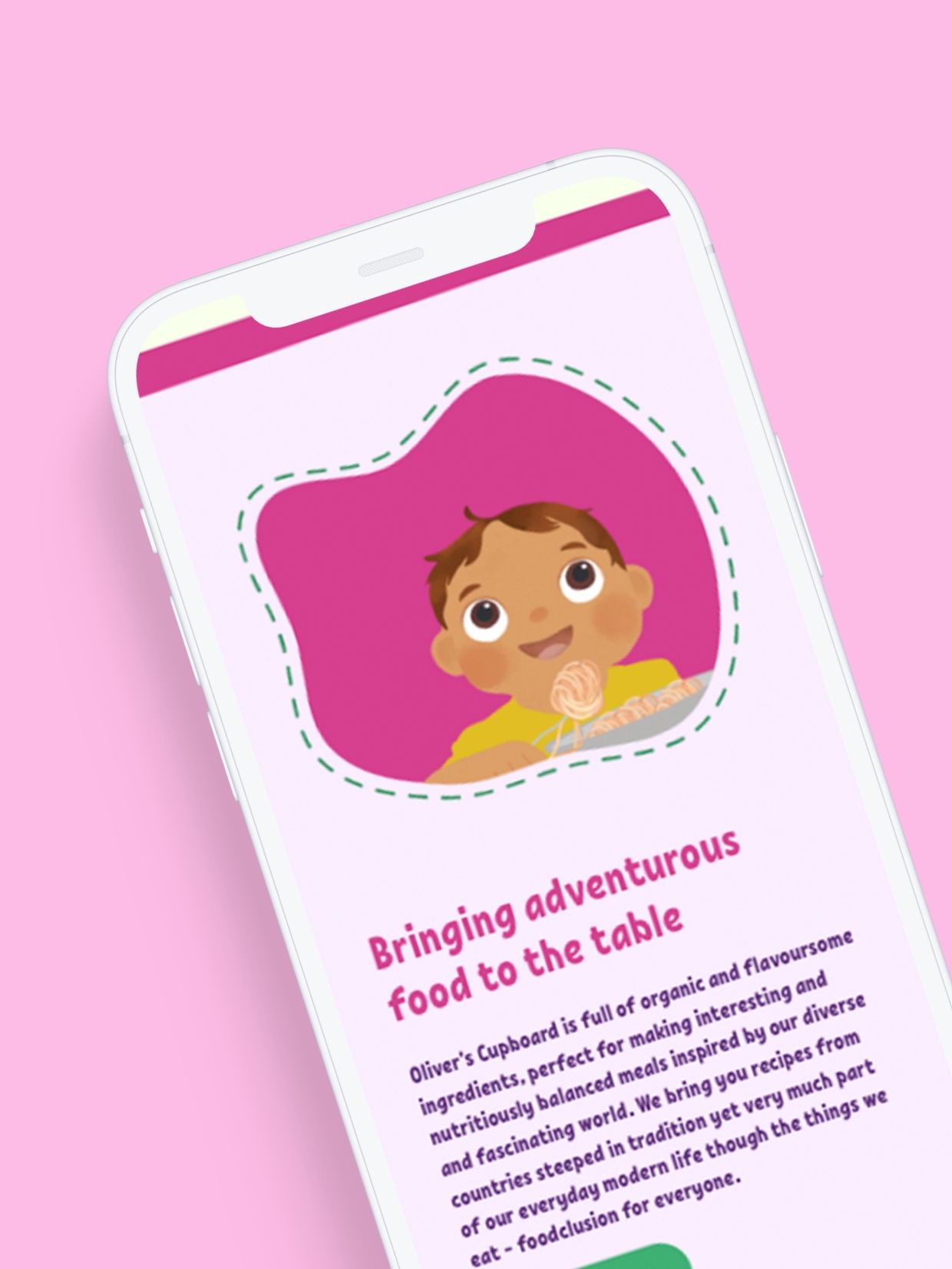
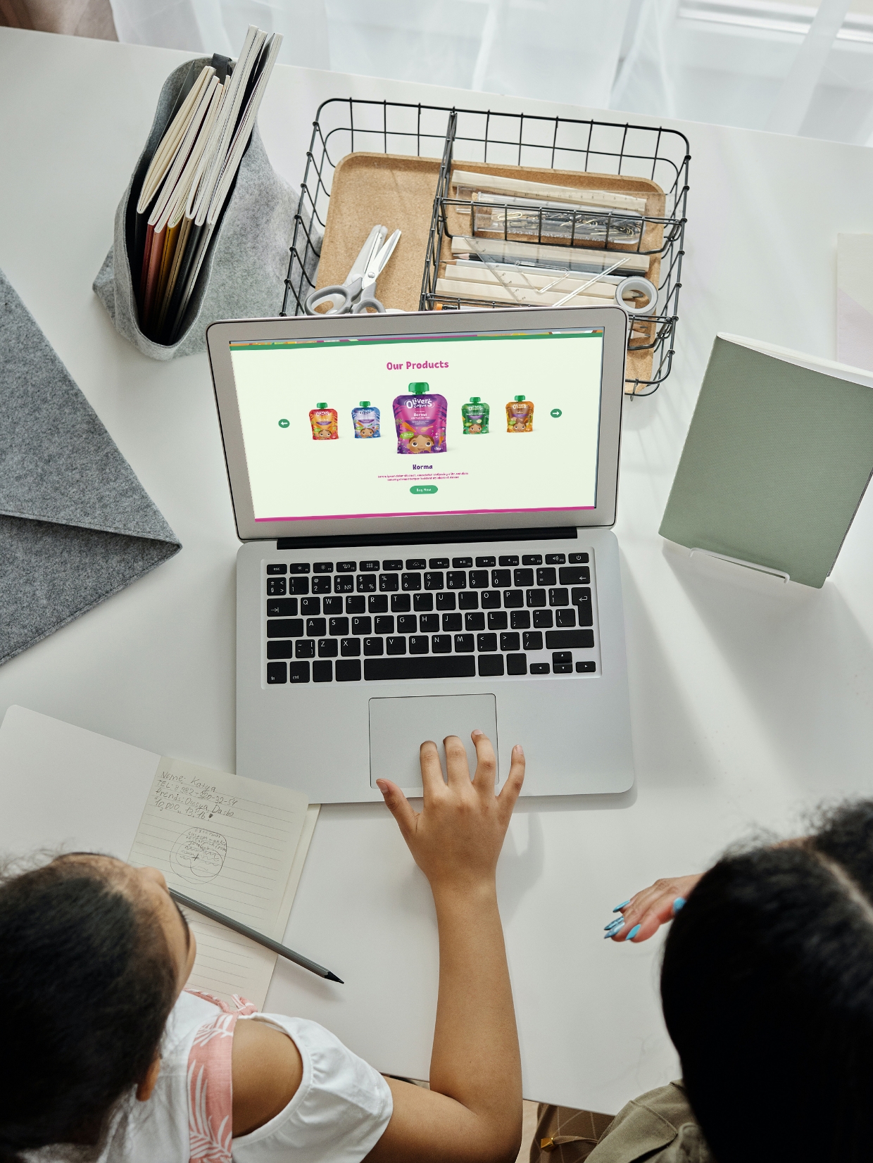
Rounding the user journey off with a tasty web experience.
Brand consistency is important across all touchpoints, especially in our digital-first age. The website is used as a destination to get more information on the products and the story behind the brand. Using subtle animations and textured backgrounds we encapsulated a playful user experience whilst ensuring that the information was easy to find.