Creating a measured difference
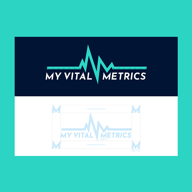
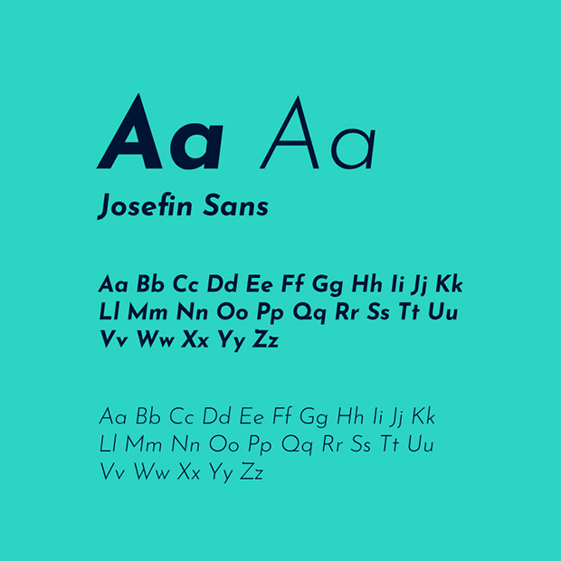
Creating a visual identity system for My Vital Metrics was all about solid, sharp lines. Achieved through a font family with the same principles, the system reflects the authoritative tone the client needed to project as a new business.

Colours for energy, type for stability.
Injecting colour into the visual identity was achieved with a vibrant green and a solid blue. Reflecting the energy and stability of the company. Choosing darker lit imagery, we were able to inject colour into the image treatments through the visual devices created for the visual identity system.


Supporting, not replacing exercise.
Using image treatments, we wanted to show that MVM supported the routines of people who used exercises in their daily lives.
