Making waves with a new visual identity
"I've bought a beach" isn't a phrase that we hear every day, so when Sophie came to us asking if we could create a visual identity for a beach, we said, absolutely!
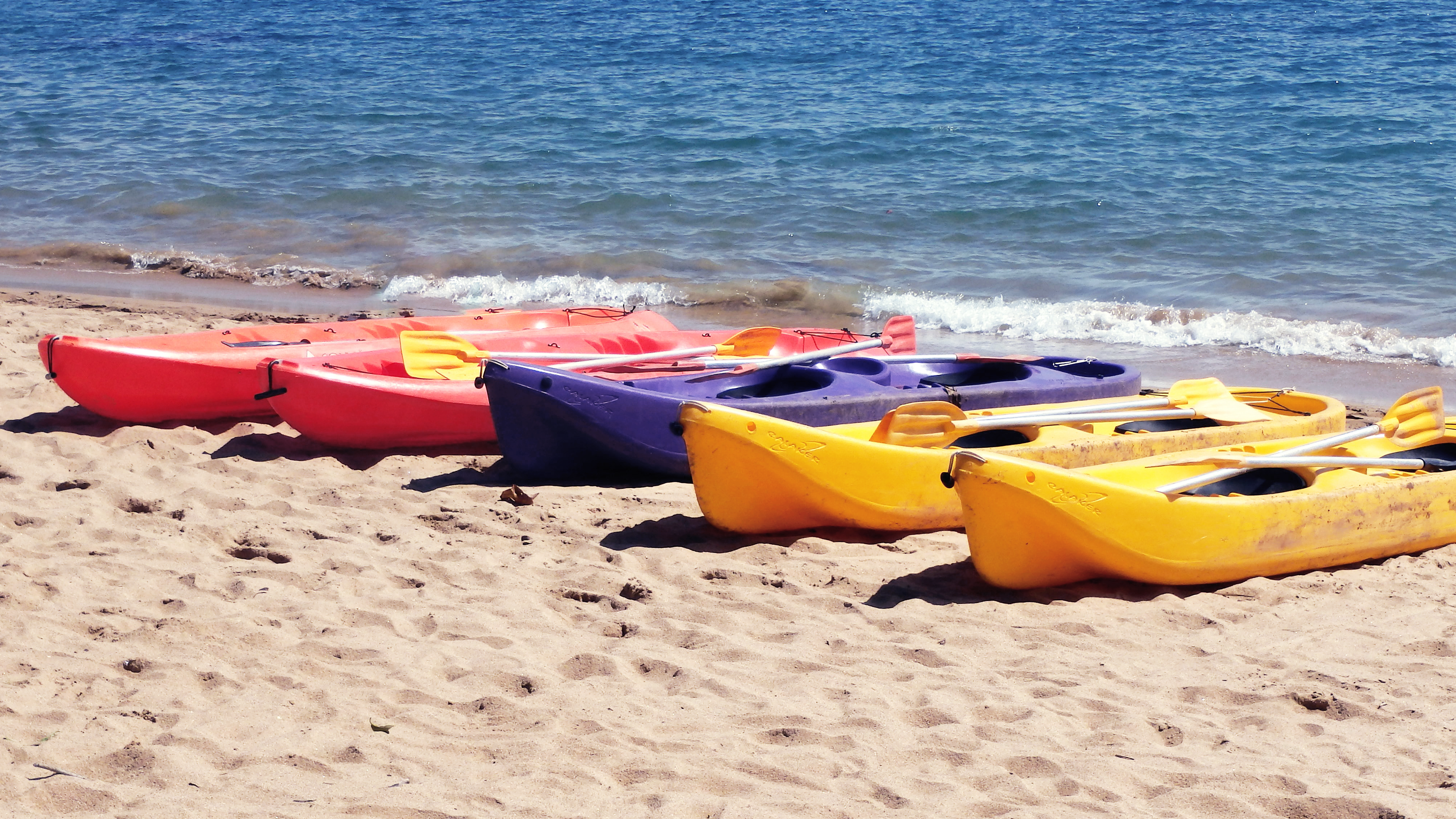
Big characters favour the bold.
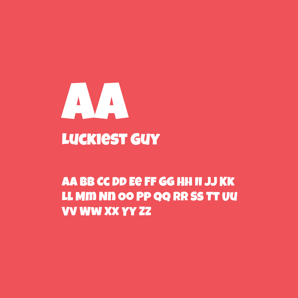
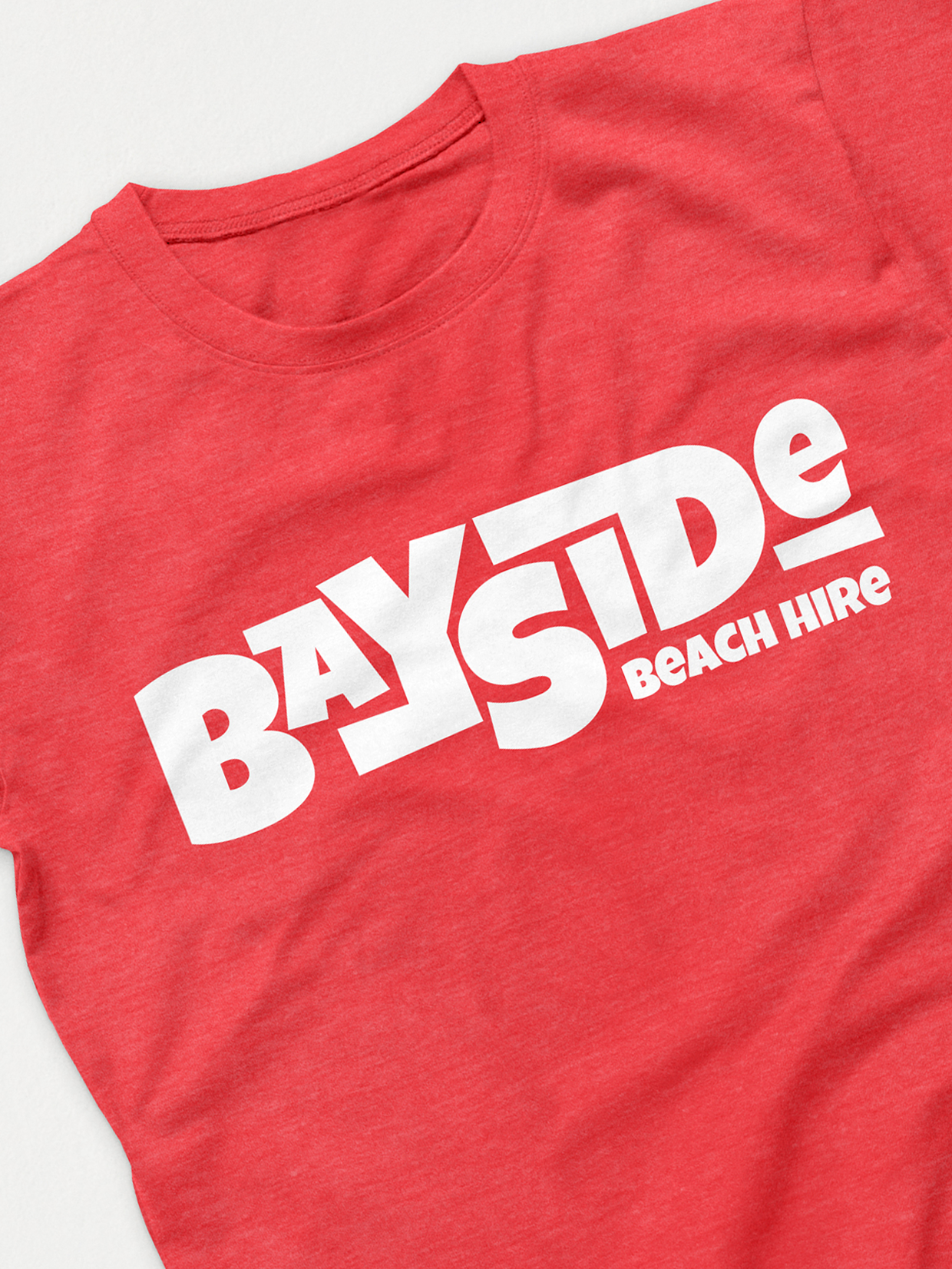
Big beach vibes, deserved a bold typeface, that could be recognized and seen for miles (once the flags were up). Taking inspiration from the popular surfing side of the beach, we developed a fun identity that evokes movement.

Summer shades.
Like a sip from your first summer cocktail, our color palette uses bright pastels, a big contrast compared the neighboring beaches who all went for blue and yellow colour palettes.
