3 of Our Favourite Design Trends to Happen to 2018

2018, the year that has so far taught us Tide Pods don’t taste great, (although pretty handy marketing for Tide) has also seen some equally interesting design trends pop up. Perhaps your company needs a facelift, a shake-up to reinvigorate your tired stock images and terrible font choices.
If so, 2018 is the year for you as design trends see a wave of colour, originality and hand-drawn take to the stage. Some of the biggest brands in the world haven’t been afraid to take the leap, this means you can too! You just got a sneak peek of what’s come throughout the design trends 2018 blog post! Without further or do here’s 3 of our favourite design trends of 2018 so far:
Colour
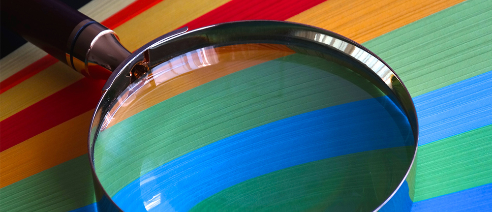
Whilst still minimalistic, colour is set to dominate your news feeds this year, with a raft of well-known brands jumping on the colour bandwagon. It seems the bolder, the better! Shoutout to eBay, who this year seems to have had a colour enema, bringing us a fabulous rainbow of marketing materials that make us pay attention, but should also potentially come with some sort of warning.

Note to self: do not insert colourful gif whilst you are still writing the paragraph.
Need inspiration? Dribbble has stolen our hearts when it comes to colour inspo, especially with its handy search by colour feature.
Illustration
As long as there has been drawing tools, humans have been illustrating, but what’s interesting this year about this discipline is how big brands have started to embrace it with open arms and use it throughout their marketing materials. We’re not talking stock, generic illustration, no we are talking custom, one-off (some may call it couture) illustration and we love it!
A new wave of mattress has sprung up (pun definitely intended) over the past few years, and with many of them claiming the same features and guarantees – 100 nights anyone? Casper mattresses have aced illustration for their visual identity to help differentiate them from the likes of Eve and Simba.

Another notable example of using custom illustration is the new marketing materials coming from Slack Slack’s artistic take on popular collaboration imagery really hits you in the face.

Confession: spent at least 10 minutes looking for the Slack logo in each of these images, turns out the two on the right don’t have it. Missed a trick there we think!
Mixed Fonts
Drum roll please, our third and final design trend for 2018 has got to be the beauty that is typography. We are all very aware that you should avoid Comic Sans unless you are a pre-school (although we would still question the necessity), and that fonts can project many an emotion, but this new trend is mixing it up! Hand drawn combined with bold fonts or even hand-drawn bold fonts! Be still our beating hearts, these font combinations are the stuff that dreams are made of!
Adobe’s digital marketing report combines hand-drawn, bold colours and custom images – but they kind of have to hit every trend possible and do it well! We adore their use of gradients and contrasting colours. Oh Adobe, you’re so 2018!

Need some inspo? This blog post by Speckyboy directs us to 20 handwritten fonts that are all free! Please, can we all take a minute to admire this font by SuperBrutt!

If you asked us to sum up our favourite trends this year into an easy to remember alliteration, we would tell you to ask better questions….just kidding! 2018 design rules are colour, custom and captivating.
How will you switch up your colour palette this year?
Categorised in: Graphic Design
