The inside story on internal tools
Reuters needed an internal platform that matched the pace and precision of their newsroom. We designed a UI system that helps teams work smarter - clean, functional, and built to handle the demands of a global media operation.
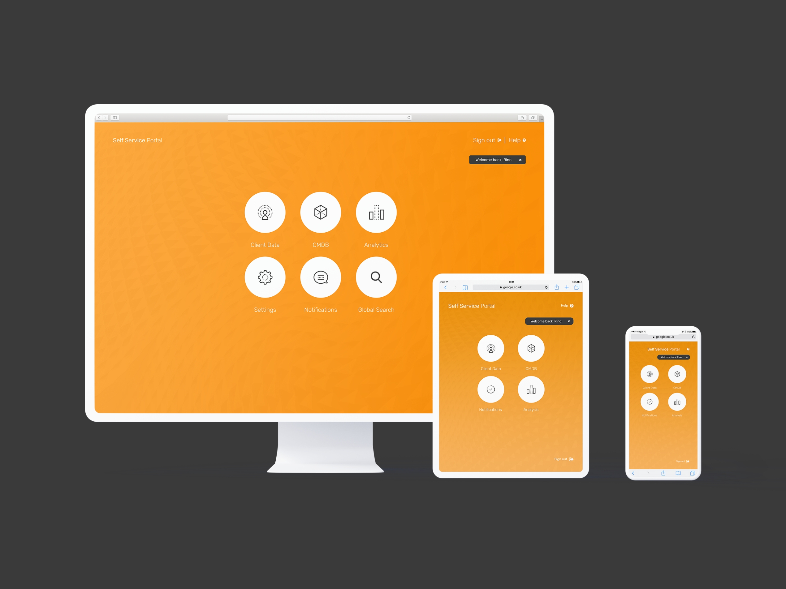
A system that scales
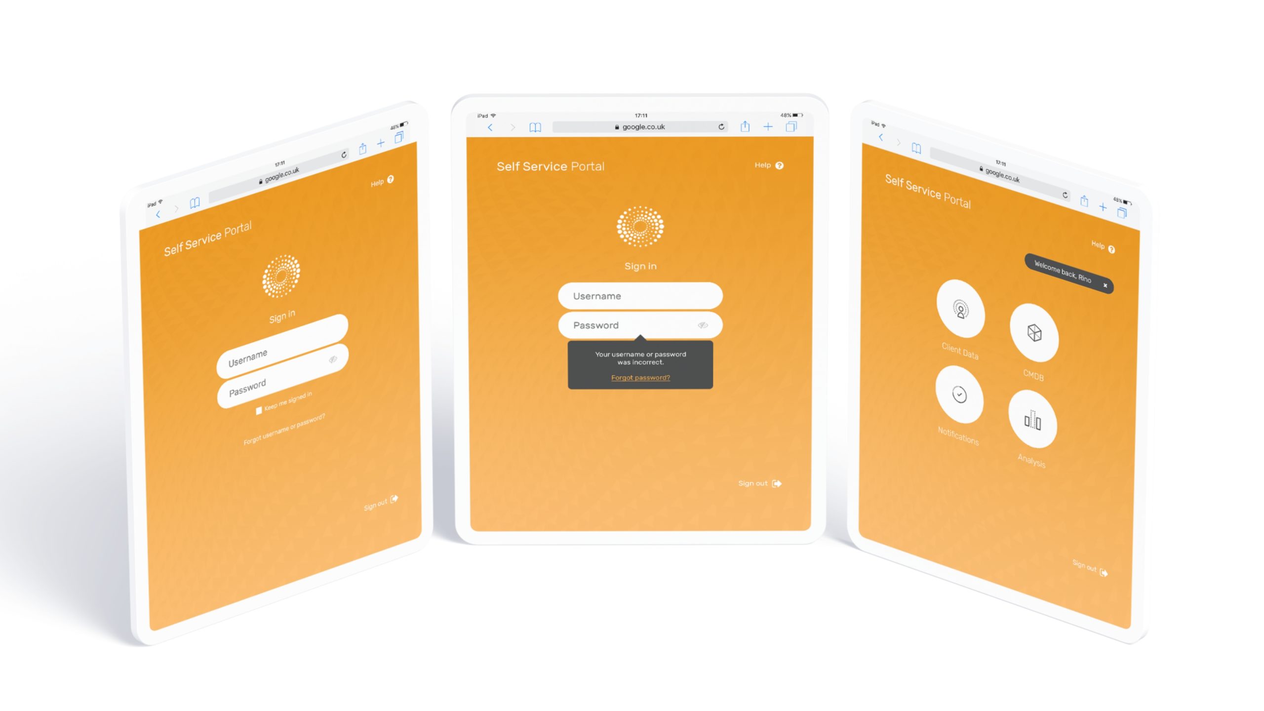
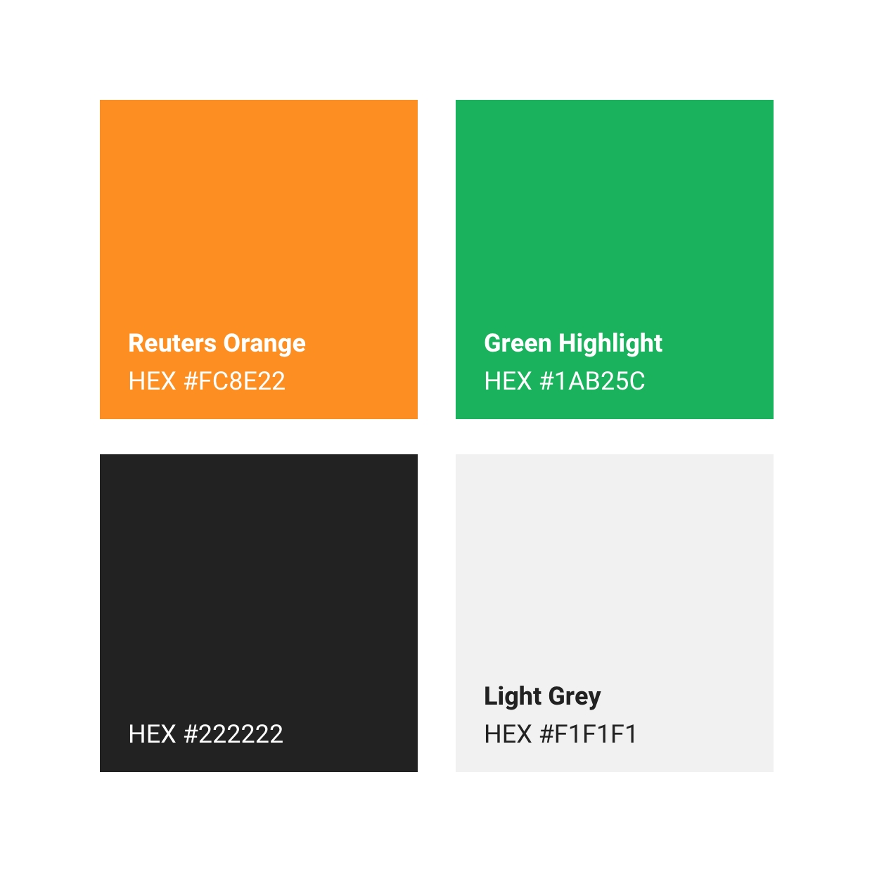
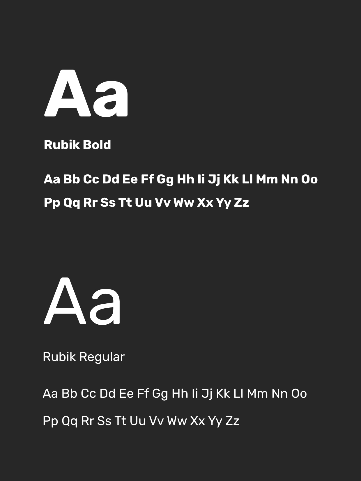
We established a visual language that works across desktop, tablet, and mobile. The design system prioritises clarity and speed - because when you're powering one of the world's largest news organisations, there's no room for confusion.
Components, not compromises
From navigation patterns to data displays, every element was designed for consistency and reuse. The toolkit gives internal teams a flexible foundation without sacrificing the polish expected from a brand like Reuters.
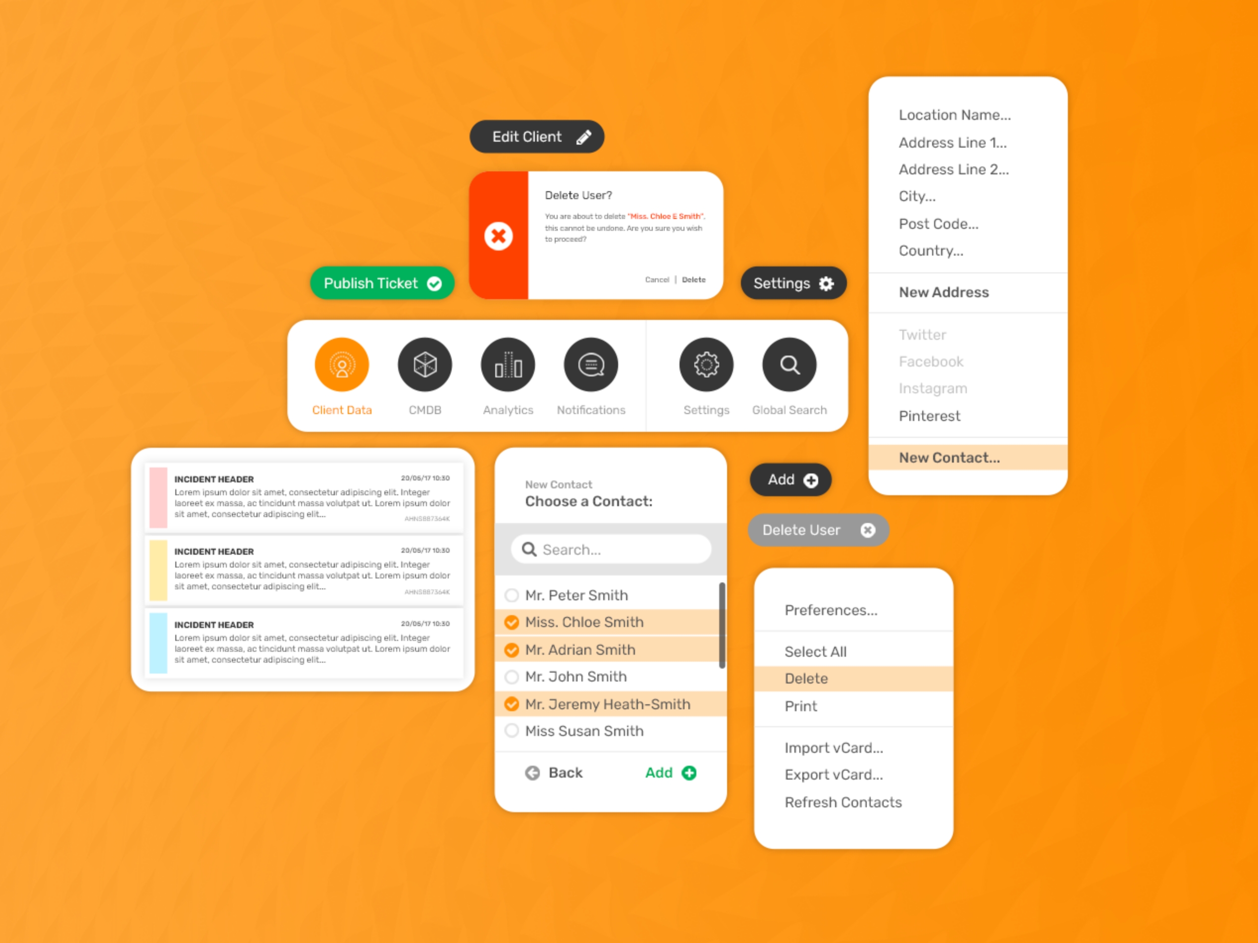
Form follows function
The interface keeps information density high while staying scannable. Orange accents guide users through workflows, while a restrained palette keeps the focus where it belongs - on the content.
Ready for the hands that use it
We delivered responsive designs and detailed specs, giving Reuters' development team everything needed to bring the platform to life across devices.
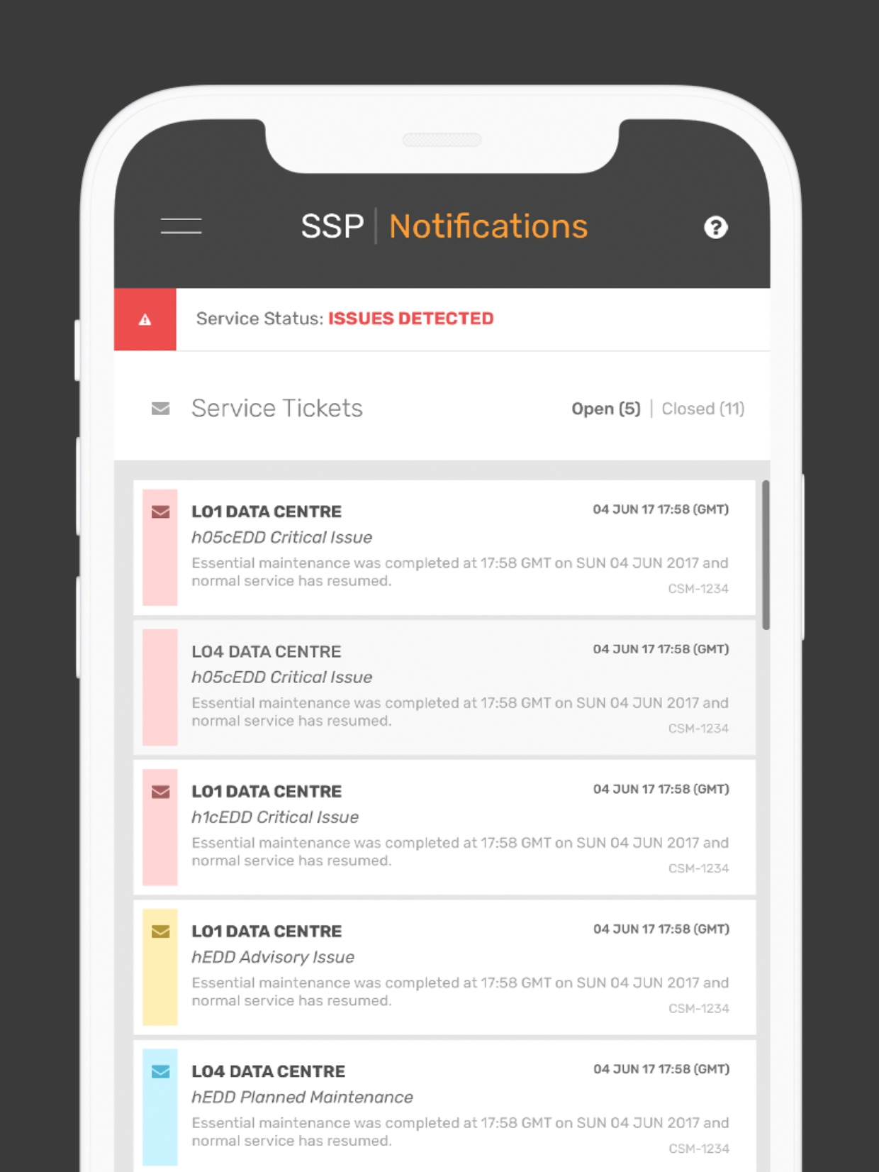
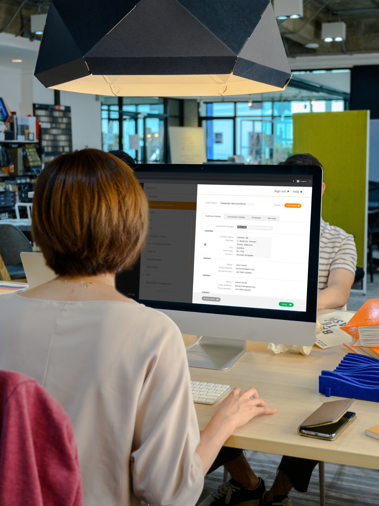
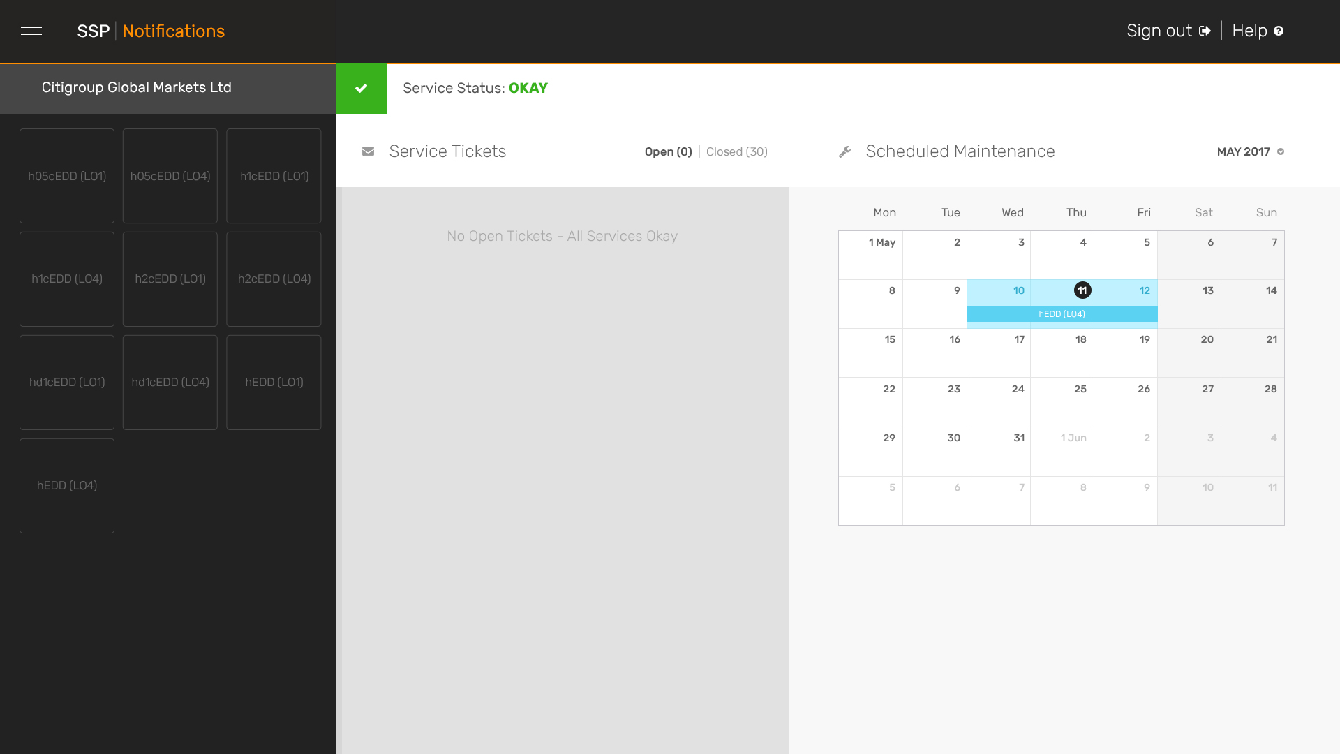
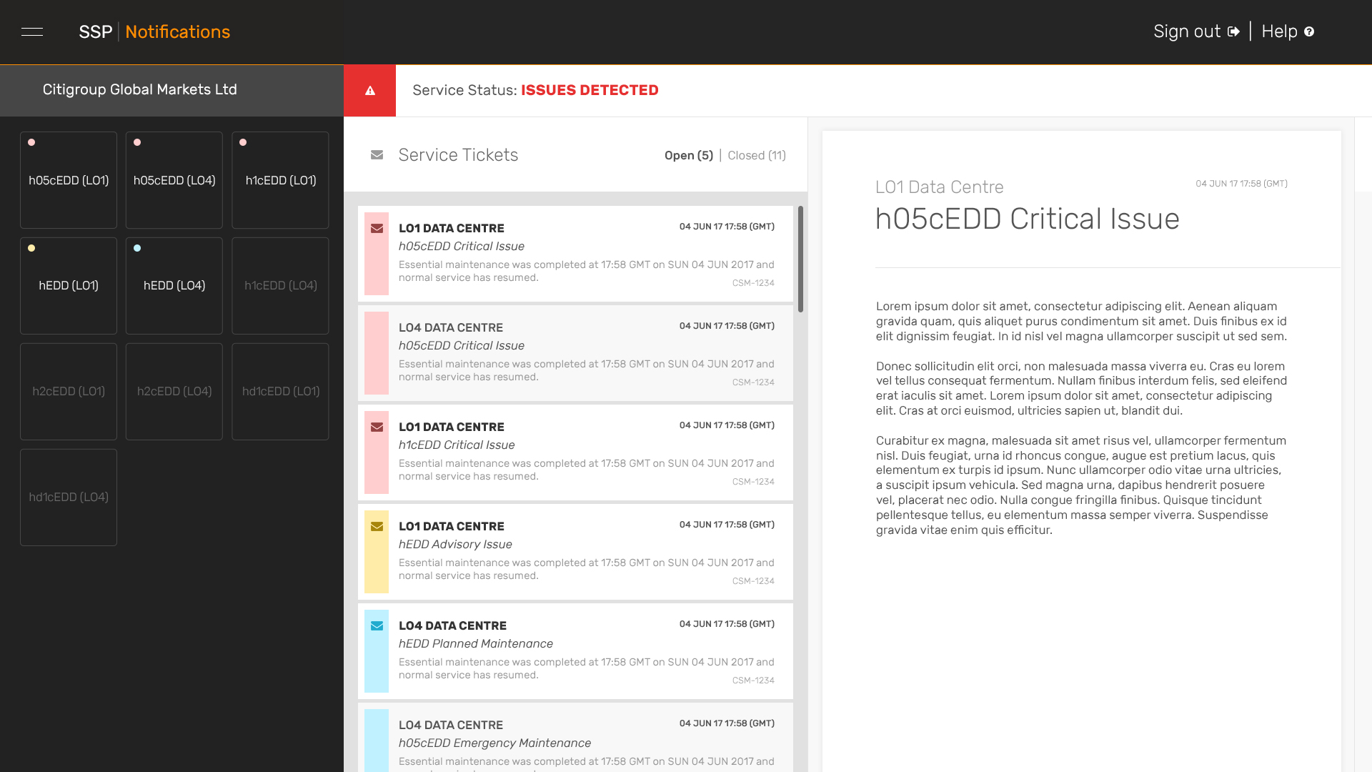
Density without the clutter
Data-heavy screens need careful hierarchy. We structured layouts to surface key information first, with secondary details accessible but never in the way.
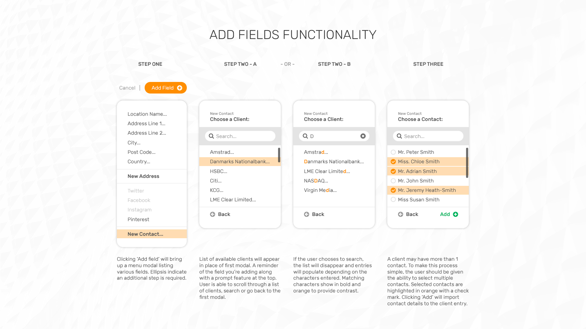
Prototyped, tested, refined
Interactive prototypes let stakeholders experience the platform before a single line of code was written. Feedback loops kept the design tight and the development handoff smooth.
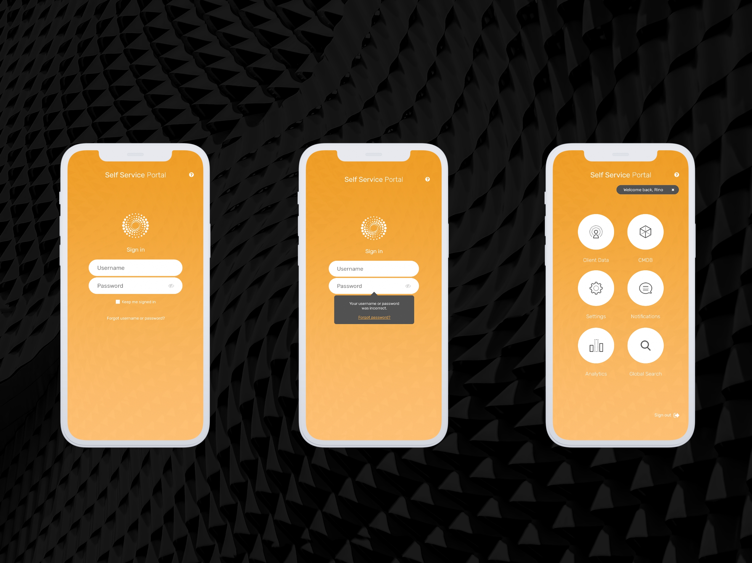
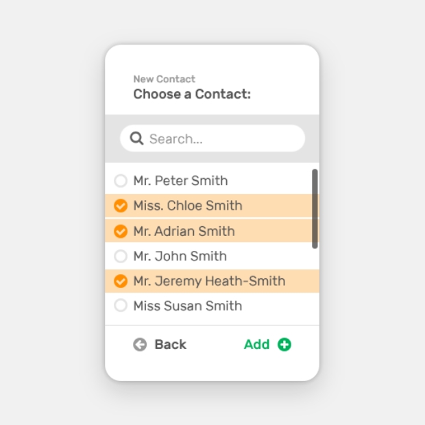
Pocket-sized and fully loaded
The mobile experience carries the same functionality without compromise. Streamlined navigation and touch-friendly components keep teams connected wherever the story takes them.